24 - Using composition for economy of line
24 - Using composition for economy of line
Ink Sketching: The Sketch Loose Method
Goals and introductions
Goals and introductions
Workshop Two: Depth and Texture: Mastering Hatching and Value
Workshop Two: Depth and Texture: Mastering Hatching and Value
Workshop 3: Finding the Flow: The Art of the Continuous Line
Workshop 3: Finding the Flow: The Art of the Continuous Line
Workshop 4: Less is More: Sketching with Economy and Purpose
Workshop 4: Less is More: Sketching with Economy and Purpose
Workshop 5: The Big Picture: Taming Complex and Challenging Scenes
Workshop 5: The Big Picture: Taming Complex and Challenging Scenes
Closing thoughts
Closing thoughts
This video ties together everything we have learned so far. We are going to look at how two classic composition rules, the rule of thirds and the Fibonacci spiral, can dictate exactly where we place our continuous lines, our textures, and our bold ink. Understanding composition is the ultimate secret to economy of line, because the best way to do less is to simply leave whole areas of the page empty!

The rule of thirds
The most common composition rule is the rule of thirds. Imagine dividing your page into three equal vertical columns and three equal horizontal rows.
The intersections: This grid creates four points of intersection in the middle of your page. These intersections are the strongest points on your page. This is where you should place your focal point, like a tall lighthouse or a charming farmhouse.
The horizon line: Don't place your main horizon line dead center. Place it along either the top third line or the bottom third line.
-
Things rarely fit perfectly though: Take the scene below, we have the principles of asymmetry and moving the focus away from the centre. But we also don't want to force everything to rigidly fit these lines.
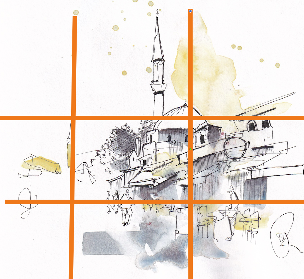
Fundamentally, this rule creates natural asymmetry, automatically moving the focus away from the boring centre of the page. Getting this idea of asymmetry is the most important thing.
The Fibonacci spiral
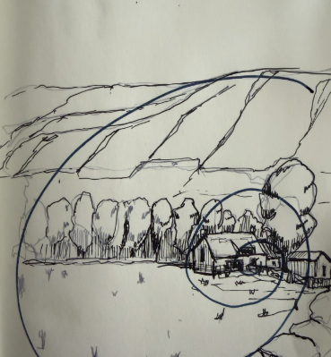
Another helpful concept is the Fibonacci spiral. This spiral sweeps across the page and curls tightly into one specific area.
The focal point: That tightest area of the spiral is exactly where your focal point should sit. This is where you will concentrate your tightest, most complex linework.
The sweeping tail: As the spiral opens up and sweeps away across the rest of the page, your linework should become less and less detailed.
To illustrate this, I am going to show you the bizarre image that made it's way onto the BBC a few years ago:

What we have above is a very 'rowdy' and busy scene. But also, a strangely pleasing photograph... the reason it works so well is because of how perfect it's composition is.
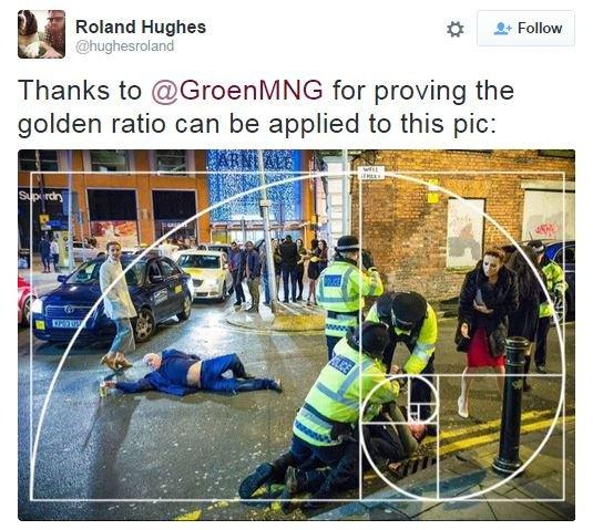
NB - the golden ratio is the mathematical description of how the spiral unfurls across the page. Hopefully you can see here in this very urban image how the 'action' is all happening along the lines of the spiral. And the open areas of the photo mirror the open areas of the scene.
Structuring depth and focus
With these rules in mind, let us structure exactly where we place our ink across the different layers of a scene.
The foreground: The foreground sits at the very front of the image. You want to apply your boldest lines here. However, it does not need fine detail! Imagine a photographer sitting in a hedge; the leaves right in front of the lens will be out of focus. Keep your foreground bold, dark, and almost abstract.
The midground: This is usually where your main focal point sits, nestled on one of those rule of third intersections. The midground is where you put all your effort. This is where you add your intricate textures, detailed hatching, and structured bold lines to separate overlapping objects.
The background: As you move away from the focal point into the background and the sky, use less and less detail. The ultimate economy of line is simply not drawing a line at all. Leave large areas of the background completely blank, or use very simple, light vertical hatching to push things far away.
The process in practice
In this video we will look at this simple composition and cover several elements that I think about for me style.
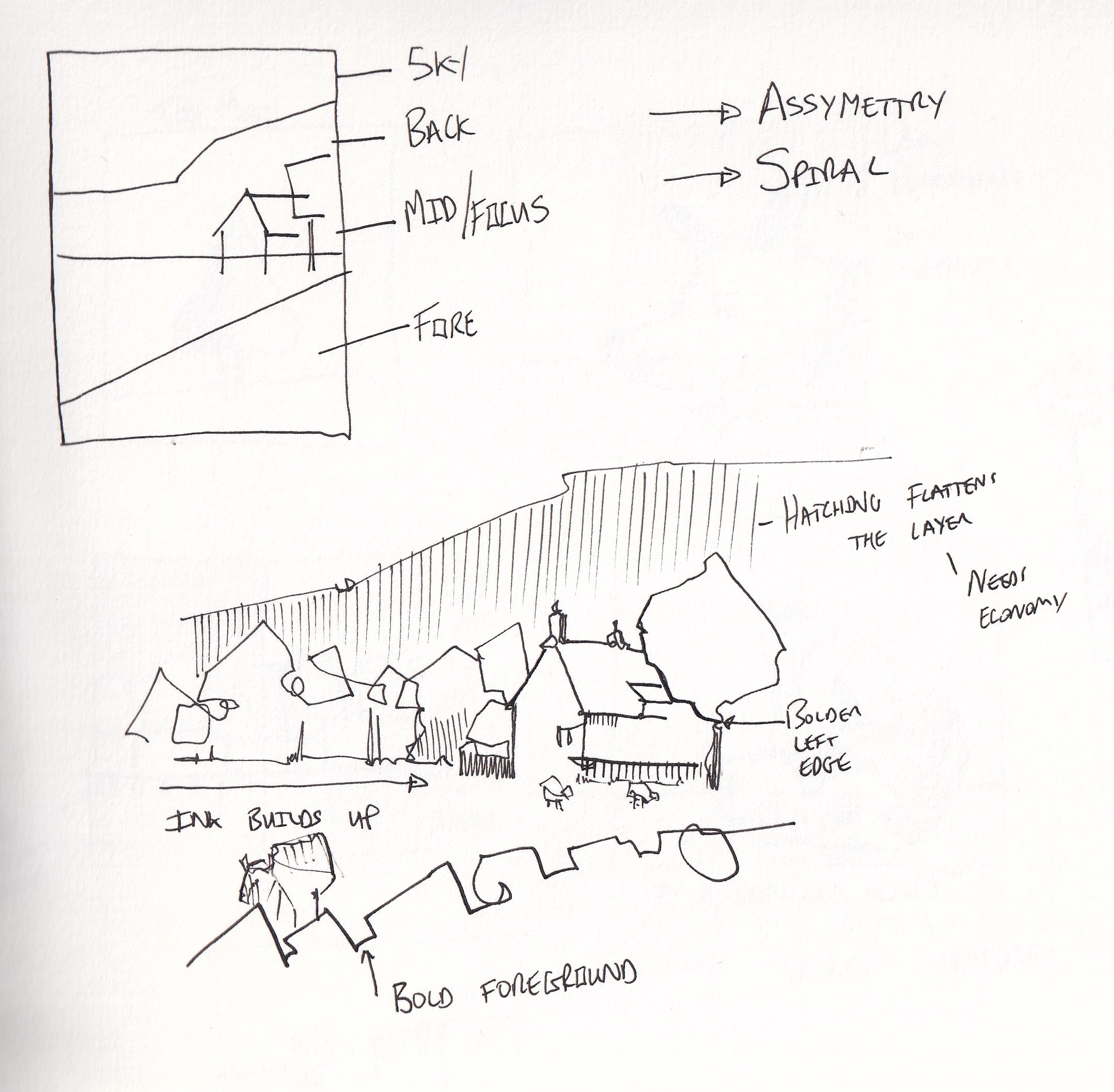
Here is a structured workflow that uses composition to guide your ink.
Start at the focus. Begin your continuous line at your main focal point in the midground. Spend your best energy and tightest linework here.
Move outward. As your line moves away from the focus towards the edges of the spiral, use less detail. Let the lines become simpler and slightly more abstract.
Establish depth. Identify your bold foreground and your quiet background.
Add textures and hatching. Return to your focal point. Add neat hatching for shadows and complex textures (like bricks or leaves) specifically around this point of interest.
Finish with bold lines. Finally, use your bold pen to create contrast around the focal point and to push those abstract foreground elements right to the front of the scene.
By understanding depth and composition, you know exactly where to focus your ink. This makes your economy of line incredibly purposeful and effective.
Extra notes
When considering the use of the fibonacci spiral, don't forget to position it assymetrically both vertically and horizontally. The sketch below is fantastic! And it works very well indeed. Just picking closely on the placement of the horizon line though, notice it is vertically right in the middle of the page - and the tighest part of the spiral is right in the middle (vertically) of the page too. Having that focus offset a little either up or down the page would be even more engaging.
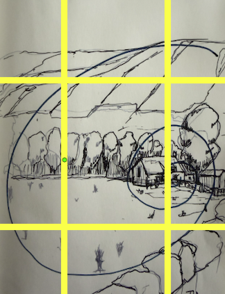
We can achieve that effect just by cropping the image differently - notice here the position of the horizon line is lower - so we have a big open sky, but not a lot of dead space in the foreground.