4 - From shapes to purpose
4 - From shapes to purpose
Ink Sketching: The Sketch Loose Method
Goals and introductions
Goals and introductions
Workshop Two: Depth and Texture: Mastering Hatching and Value
Workshop Two: Depth and Texture: Mastering Hatching and Value
Workshop 3: Finding the Flow: The Art of the Continuous Line
Workshop 3: Finding the Flow: The Art of the Continuous Line
Workshop 4: Less is More: Sketching with Economy and Purpose
Workshop 4: Less is More: Sketching with Economy and Purpose
Workshop 5: The Big Picture: Taming Complex and Challenging Scenes
Workshop 5: The Big Picture: Taming Complex and Challenging Scenes
Closing thoughts
Closing thoughts
This video has two distinct, simple tasks. But ones that are rich with learning points and ideas!
Task one
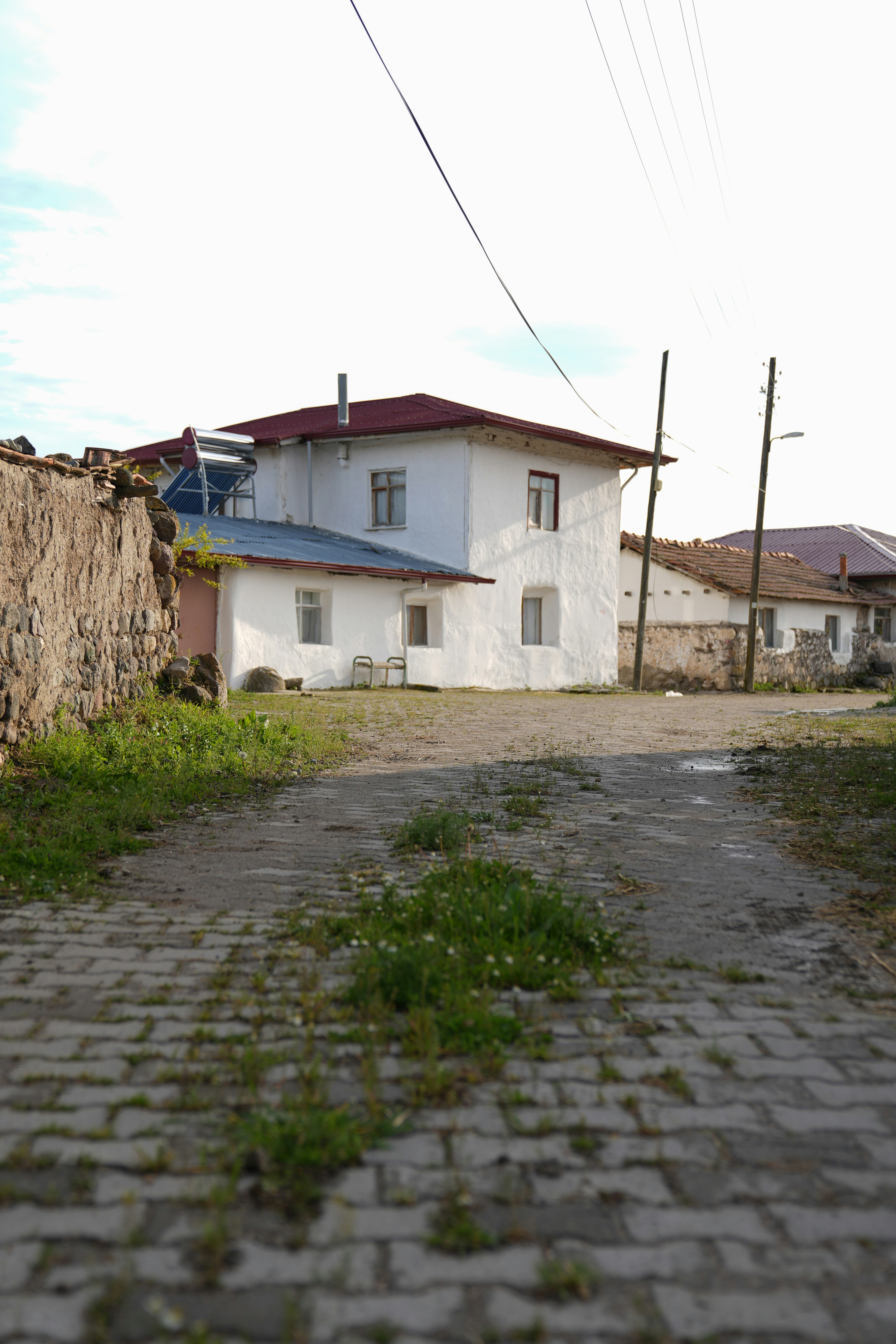
Firstly, we are going to look at purposeful lines using the ‘white house’ reference photo (see below). In this, I want you to identify the primary decision points and, mark the corners and intersections where the structure changes direction. Then practice connecting these dots using purposeful lines that reflect the actual texture of the building, or perhaps an exaggerated or invented texture that fits your style.
Task two
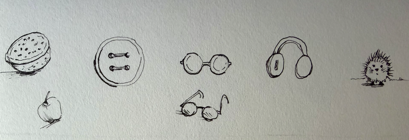
Second, we will explore more about the idea of textures using a simple circles exercise. Here, I’d like you to sketch between six and twelve different objects that all begin as a basic circle. Make sure that your initial circle has texture, then apply hatching and bold lines to each shape to experiment with light, shadow, and the separation of different planes.
The Power of Purposeful Lines
Every mark you make on the paper should start with a decision. We call the corners and pivots of a shape decision points. When you move your pen from one point to another, avoid the temptation to draw a smooth, loopy line. Instead, give the line a specific purpose. A purposeful line is one that tells the viewer something about the object, such as its age or material. A slight wobble can indicate a weathered stone wall, while a sharp, straight movement suggests something modern and rigid. If your lines are too soft and flowing, the drawing will lack character and feel less accurate, even if the proportions are correct.
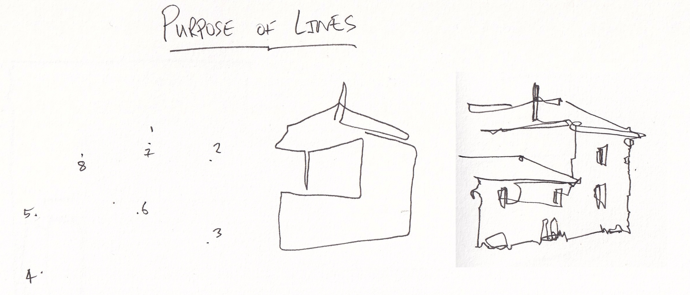
In the image above, I've marked my dots. Then done a loopy sketching the middle with no purpose. Notice how this absolutely doesn't capture the scene. But the scene on the right, more angularity, strong sense of intention - that really does capture our scene.
Your reference
Understanding the White House Scene
The White House photo is an excellent study for simplifying complex information. Even though it looks intricate, you can identify basic shapes like circles, triangles, and rectangles within the architecture. Use your anchor measurements to ensure the height of the pillars relates correctly to the width of the roof.
Accuracy in this context is not about making a perfect replica. It is about capturing the essential information of the scene. Small shapes and fine details are not just decorations; they are the bits of data that explain the scale and depth of the building to the viewer.
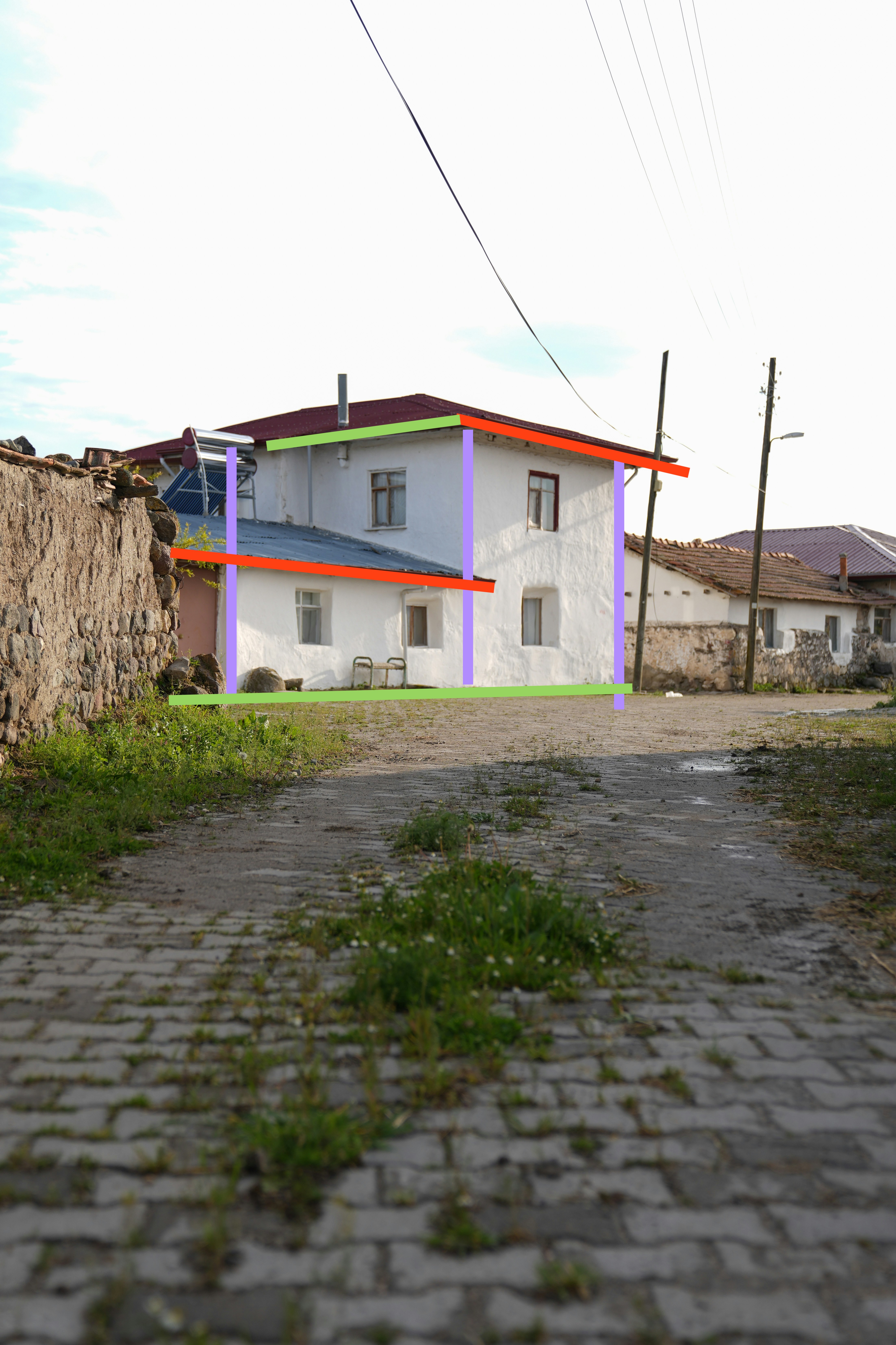
There are key lines to find, and it's important to get the direction/angle of these lines relatively correct. Below I've marked up the image - notice the purple lines are strictly vertical, the red lines go down the page (higher on the left than the right), and the green lines go up the page (lower on the left than the right).
The Circles Exercise and Line Quality
A circle is the perfect foundation for practicing mark making. Even highly textured objects like trees or fluffy animals are rooted in circular forms. By changing your line quality, you can turn a simple circle into a vast array of different things. A smooth, light line suggests a polished surface like a bowling ball. An irregular, textured line might suggest an organic object like an apple. The key is to be intentional with how you use light, smooth, bold, or irregular marks to define the character of the object.
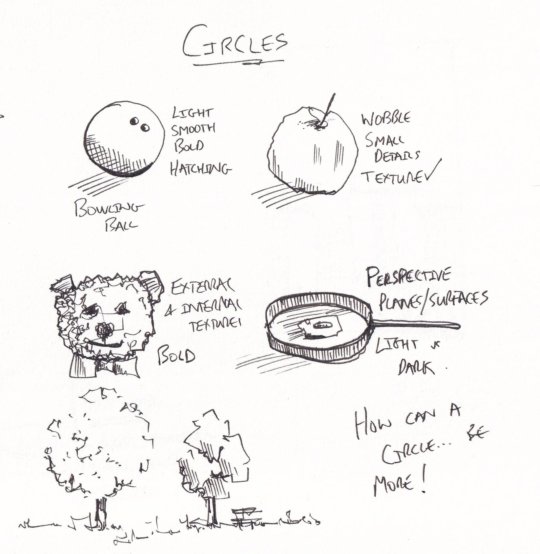
Concept 1 - External and internal textures
A vital concept for believable sketching is the relationship between external and internal textures. The external texture is the contour or the outline of your object. The internal texture consists of the marks you make inside that boundary. For an object to feel cohesive, these textures must match. If you draw a fluffy teddy bear with a jagged, irregular outline but use smooth lines for the details inside, the drawing will feel like a disjointed cartoon. Matching the energy of your marks across the whole shape ensures the object feels like a single, solid entity.
Concept 2 - Bold lines and visual weight
Bold lines are used to provide clarity and weight. By thickening the line where an object touches the ground, you anchor it in space. Bold lines are also useful for separating objects that overlap, such as a bunch of cherries. By using a heavier line on the objects in the foreground, you immediately tell the eye which items are closer to the viewer. We will explore bold lines as a tool for focus later in the course, but for now, use them to add definition and separate your shapes from one another.
Concept 3 - Hatching, planes, and perspective
Three dimensional depth comes from the way we handle light and shadow. Hatching is our primary tool for this. For these exercises, keep your hatching simple and light. Its main job is to separate planes. A plane is a flat surface facing a specific direction. By adding hatching to one side of a shape, you indicate that the surface is turning away from the light. Hatching can also be used to flatten distant objects or send them into the background. When you combine this with perspective, such as flattening a circle into an oval for a frying pan, you begin to create a convincing sense of 3D space. Lots more is coming up on this in workshop 2.
Concept 4 - Incomplete shapes
You do not always need to complete a shape for it to be recognisable. In fact, leaving a circle incomplete can make a drawing feel more loose and professional. This is especially true for organic subjects like trees, where a full, closed circle can look too rigid. By using a series of incomplete circles and varying your line weight, you can suggest complex foliage without drawing every leaf. These relationships between lines and white space allow the viewer's mind to fill in the gaps, making the final sketch much more engaging.
20 Circular Objects for the Brief
A polished bowling ball
A weathered wooden barrel seen from the top
A fluffy dandelion
A heavy iron manhole cover
A ripe orange
A vintage pocket watch
A single coil of thick nautical rope.
A magnifying glass
A slice of a tree trunk
A soft, knitted ball of yarn
A round porthole
A decorative ceramic plate
A compass
A bubble floating in the air
A heavy stone millstone
A classic dartboard
A round loaf of crusty bread
A bicycle tire
A sunflower head
A crystal ball
Extra notes:
I have included notes on the perspective of the white house scene above, please refer to those if I have mentioned something regarding the perspective of your scene.
Mark also shared with me this rather interesting image - here we have a bottle cap where the natural shape/textures have been used to accentuate/give the feel of feathers. Rather a clever way to bring this idea from 2D into a 3D piece of art..
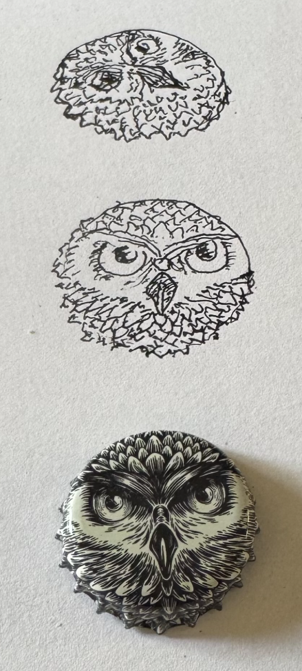
There are also some really interesting touches in the exampl below from Miss P. Notice all the 'smooth' and rounded shapes, but how they become varied and 3D through variety in weight of line despite the actual textures being flat. Also the hedgehog is adorable.