3 - Accuracy and measuring techniques
3 - Accuracy and measuring techniques
Ink Sketching: The Sketch Loose Method
Goals and introductions
Goals and introductions
Workshop Two: Depth and Texture: Mastering Hatching and Value
Workshop Two: Depth and Texture: Mastering Hatching and Value
Workshop 3: Finding the Flow: The Art of the Continuous Line
Workshop 3: Finding the Flow: The Art of the Continuous Line
Workshop 4: Less is More: Sketching with Economy and Purpose
Workshop 4: Less is More: Sketching with Economy and Purpose
Workshop 5: The Big Picture: Taming Complex and Challenging Scenes
Workshop 5: The Big Picture: Taming Complex and Challenging Scenes
Closing thoughts
Closing thoughts
In this video, we are moving from testing pens to simplifying a real scene. And we start by asking a big question: what is accuracy?
You might think that tracing a photo gives you a perfectly accurate drawing because the proportions are exact. However, a smooth, traced line often lacks the true information of the scene. Accuracy is about more than just geometry. It is about capturing the texture, the age, and the character of what you are looking at. A perfectly proportional box is not necessarily an accurate representation of an old, weathered barn. We want to move beyond just illustrating and start providing real information with our ink.
Your task
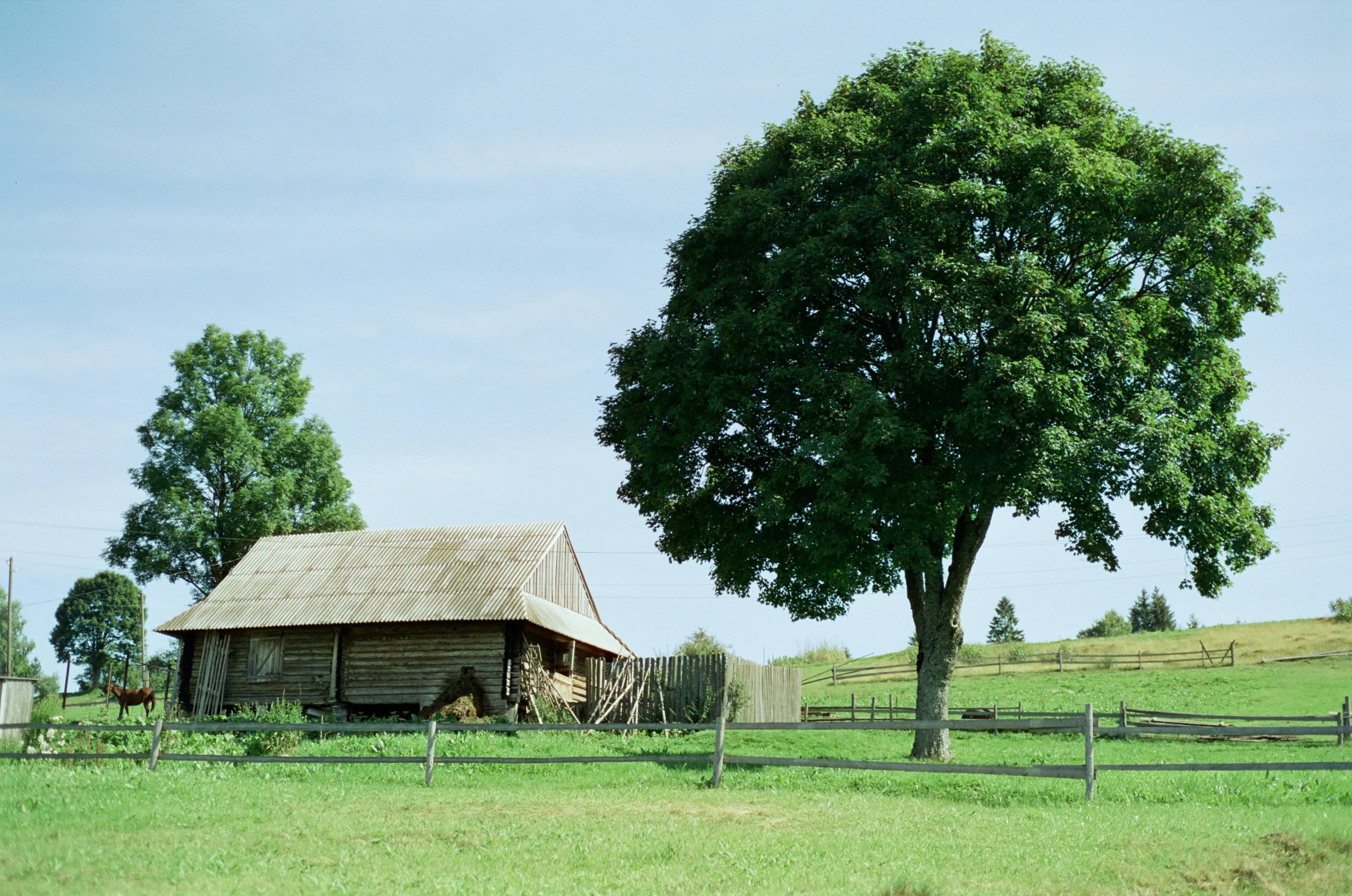
Your challenge is to take the reference photo provided below and break it down into its simplest forms. You can use tracing paper, parchment paper, or even the markup app on your phone to find the basic shapes. Look for the rectangles in the barn, the triangles in the roof, and the circles in the trees. Identifying these shapes makes the scene much easier to remember.
NB - please check the extra notes below for alternatives to tracing
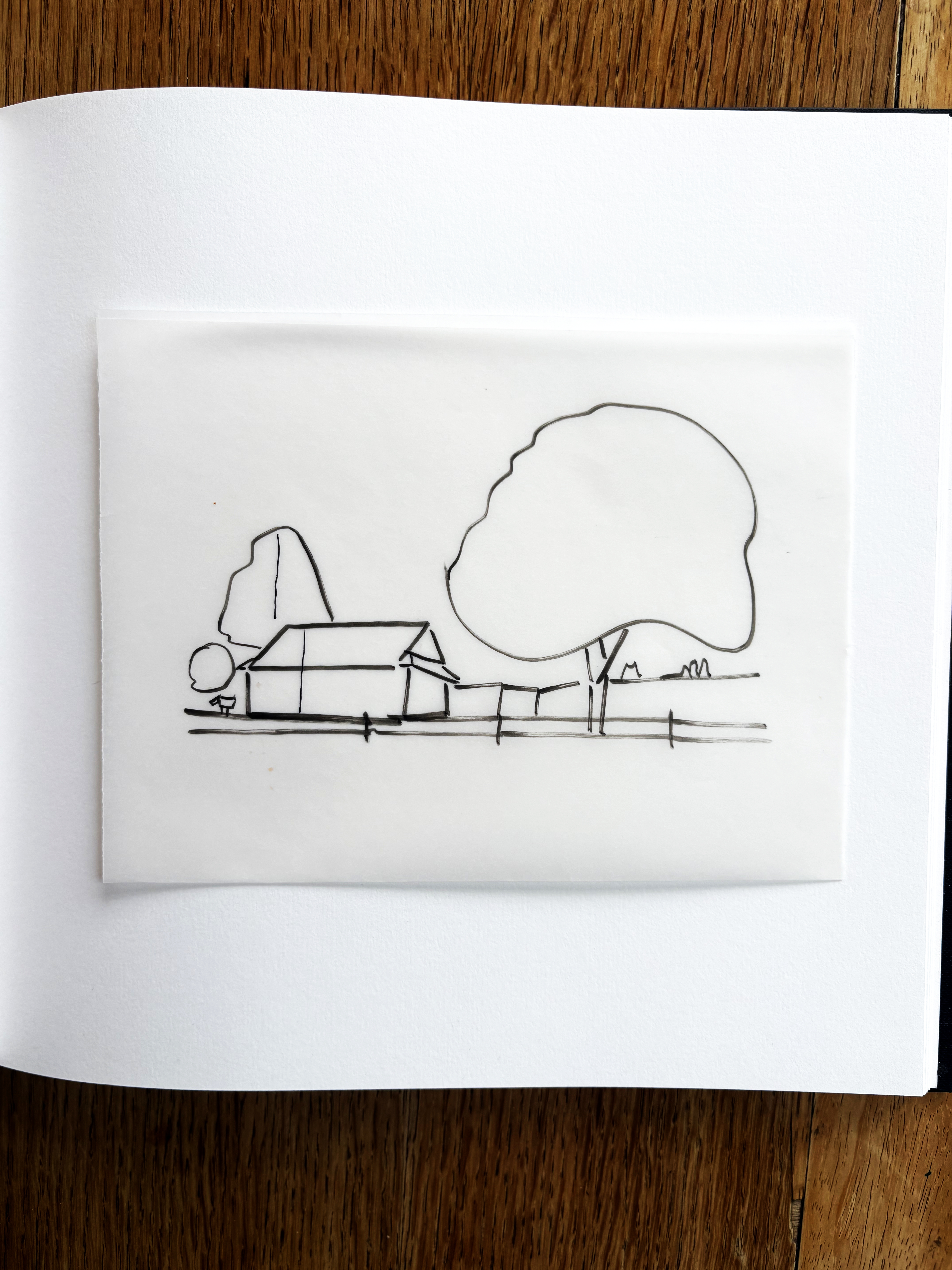
Once you have found these shapes on your tracing layer, we will move over to the sketchbook to draw them for real. This is where we stop tracing and start observing how these shapes relate to one another.
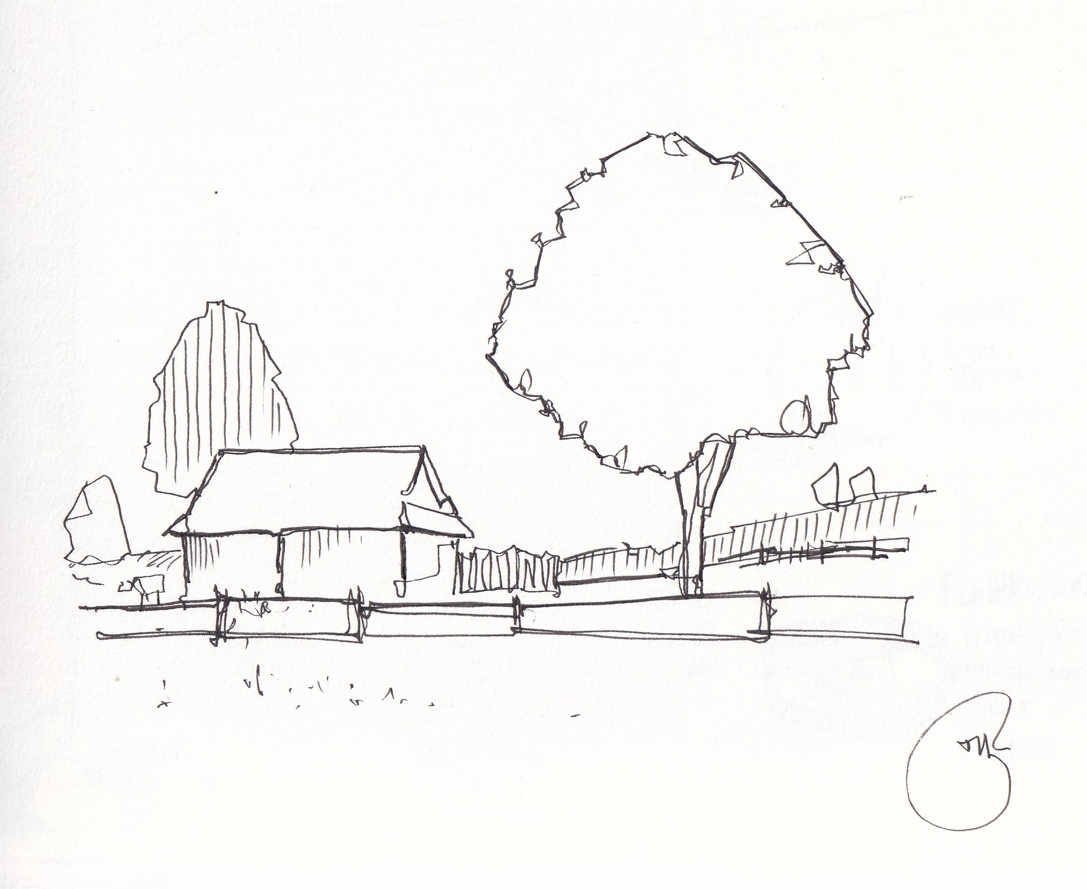
Notice here how I've kept things really simple. But also included a little texture in almost all of the contours. That builds neatly on the next video, where we will use textured circles created a set of interesting objects. And perhaps, in the tree, you can see the same idea of a 'textured' circle.
Your Reference
The five measuring techniques
First marks set the scale - Every drawing starts with your very first mark. This initial shape or line is what decides how large everything else will be. If you draw your first building too big, you will run out of space for the trees later. By being mindful of this first mark, you control the entire composition from the start.
Anchor measurements - This technique involves using one part of the scene as a constant ruler. For example, you might notice that the height of a hut is the same as the width of a nearby tree. Once you have established that anchor, you can use it to measure every other object on your page to keep them in proportion.
Intersections and cross checking - You can look for imaginary vertical or horizontal lines that connect different parts of the scene. You might see that the corner of a roof lines up perfectly with the edge of a fence post. By checking these intersections, you ensure that your objects are positioned correctly in relation to each other.
Eyeballing - This is a more fluid and intuitive way of measuring where you trust your vision. You look at the reference and then look at your page to estimate distances and angles. It is less about formal math and more about getting a feel for the relative sizes of things as you draw.
Using dots - Before you commit to any permanent ink lines, you can place small dots at key points like corners or where an angle changes. These dots act as placeholders that you can double check. Once you are happy that the dots are in the right spots, you can simply connect them to create your final shapes.
Purpose of lines
If you're using dots, then once your dots are placed, it is time to connect them. This is where the purpose of your lines becomes vital. Even if you aren't using those dots, we still have all these decision points where the corners of our shapes exist. Many people tend to loop their lines or draw smooth, characterless curves. I want you to avoid that. Instead, use purposeful movements that reflect the texture of the object.
For example, a tree should not be a smooth circle. It should be a series of intentional, repetitive marks that suggest leaves and branches. A building might need sharp, specific movements to show its structure. When your lines have purpose, they provide information about age, material, and relationships. This makes your drawing feel much more accurate than a simple, perfect trace ever could.
Below, don't forget to share your sketch with me. And let me know, does the idea of a "perfect" trace being inaccurate change the way you look at your reference photo?
Extra notes:
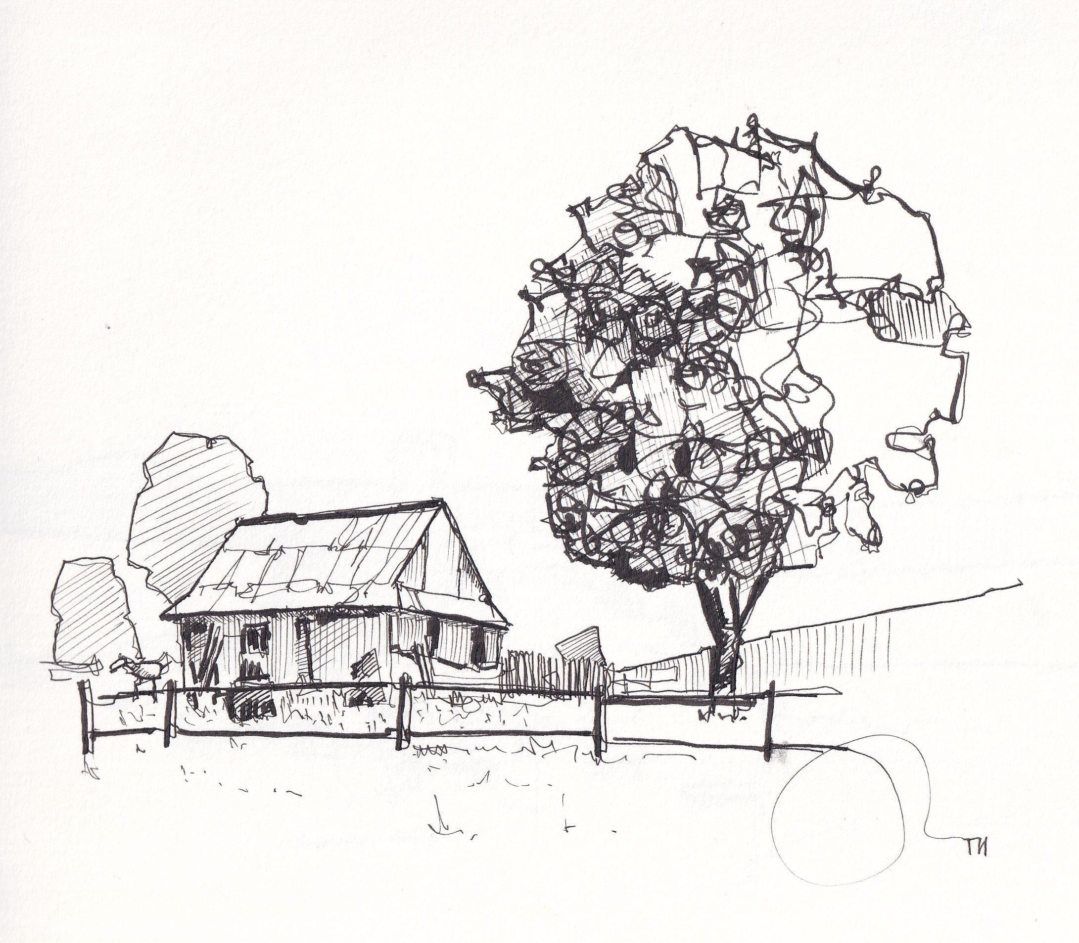
Firstly, I want you to be aware of where we are heading in this course. It all starts feeling quite simple, although simple itself can still be very challenging. But these same ideas can quickly build using hatching (workshop 2), continuous lines (workshop 3), economy of line and space (workshop 4) to create something really fascinating on the page. Below, is another example of this scene where I have continued to work into the image and built it into something with real depth
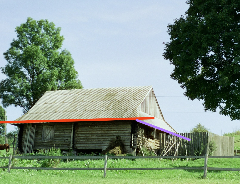
A second point I want to raise is the perspective of the image. Notice the red line below is essentially flat, horizontal on the page. Whilst the purple line angles down, going away from us. Keep that in your mind as your make those first marks on the page. A really common challenge in perspective is to flip the lines to be angling the other way - if I've made a comment that suggests your perspective is 'going the wrong way' then take a look at the lines I've draw here, and see how they fit on your scene.
Tracing over your phone screen is a handy shortcut, but turning a sensitive touch screen into a makeshift lightbox can be pretty frustrating if you haven't done it before. If you are struggling - simply do this exercise freehand - in many ways you will learn more from this than tracing. The principles of the exercise are the same, and you can watch my video for a little guidance.
Ideally, and most simply, just print the reference photo. If you don't have easy access to a printer. Here is how to fix the common annoying issues so you can focus on your line work, along with some tips on how to handle the exercise freehand if you want to ditch the screen completely.
ALTERNATIVE ONE: Going freehand instead
If the phone setup feels like too much trouble, just drop the tech and try the freehand approach. Continuous line drawing is not about making a perfect replica, it is about teaching your brain to see how shapes connect.
The 80/20 rule: Look at your reference image 80% of the time, and look down at your paper only 20% of the time.
Keep your pen down: Once your pen touches the page, do not lift it up until you are finished. If you need to move to a new area, draw a path right through your existing shapes to get there.
Embrace the shaky lines: Your proportions will probably look a little distorted without tracing, but that is exactly how it should be. Freehand continuous line drawings look wonderful because they are loose, expressive, and unique.
ALTERNATIVE TWO - digital traving using the built-in markup tool
How to use markup on an iPhone
Open the photo: Go to your Photos app and select the reference image you want to sketch.
Go to edit mode: Tap the Edit button in the top right corner of the screen.
Open markup: Tap the small pen tip icon in the top right corner. This will bring up your drawing toolbar.
Choose your tool: Select a pen, marker, or pencil from the bottom of the screen. You can tap the tool a second time to change the line thickness or adjust the opacity slider so your lines do not completely block out the photo underneath.
Draw your line: Use your finger or a stylus to trace your continuous line directly over the image. When you are finished, tap Done in the top right corner to save your sketch to your camera roll.
How to use markup on an Android
Select your image: Open your standard photo gallery and tap on the picture you want to use.
Tap edit: Look for the edit button at the bottom of the screen, which usually looks like a pencil icon or a set of sliders.
Find the drawing tool: Scroll through the options at the bottom until you see a tool labeled Markup, Doodle, or Draw.
Pick your brush: Choose your preferred pen style and select a bright color that stands out clearly against your photo background.
Trace your sketch: Draw your continuous line right on top of the screen. Once you are happy with the result, tap Apply and then Save to store the drawn-over image in your gallery.
ALTERNATIVE THREE - Setting up your phone as a lightbox
Stopping the paper from sliding
When your paper moves it can be a little annoying.
The tape trick: Use a tiny piece of painter's tape or Washi tape to stick the top edge of your paper to the back of your phone case. If you only have regular clear tape, stick it to your clothes once or twice first to take away some of the stickiness so it does not leave a residue on your screen.
The hand anchor: If you do not have tape, use your non-drawing hand to firmly pinch the top edge of the phone and paper together. You can rest the pinky of your drawing hand on the screen to help steady your position.
Managing a sensitive touch screen
Nothing ruins a drawing faster than accidentally zooming in 400% with your knuckle.
Lock the screen: On an iPhone, turn on Guided Access in your accessibility settings. This lets you triple-click the power button to temporarily disable the touch screen entirely. On Android, look for App Pinning or a Screen Locker app in the store to freeze the screen while you draw.
Extra notes:
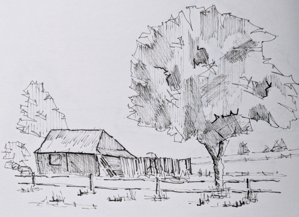
I'm going to bring in some concepts that I will talk about a lot through this course early in these extra notes. Below is an example of a really fascinating version of this scene - the main tree has lots of intense and dense (but well controlled) hatching. Notice the hatching is neat, and doesn't overtake the lines. This leads to a really interesting and stylised appearance, not everyone will like this (the nature of a style), but I do and think it's really well worked.
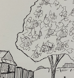
There are, however, lots of ways to approach this tree. These internal textures below, for example, are fascinating. Just lots of doodley 'scumbbling' as it's called. With space as well. You could even take this further and it would still be very successful. One extra thing this could do is have the contour more closely match these internal textures - notice the contour is a tiny bit 'fluffy' - like a sine wave gently moving - it has less of that inherent randomness and purpose and almost messy feel of the internal textures so it clashes a bit. Matching these internal and external textures is really important (in my opinion).
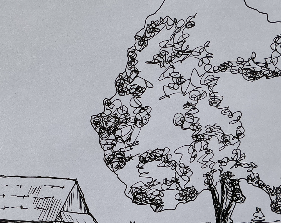
This next example has very similar scumbling marks (I'm not sure how to spell that!) - but notice how the extrenal contour matches the internal textures which just holds things together a tiny bit more.
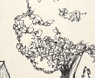
This last example has some very good ideas in it, and the scene feels great too. We might, however, notice it feels flatter - with the contour obviously very different from the internal textures + hatching sitting on top. This is an example where we have lots of different ideas, all of which are great! But just not quite working together.