- May 2, 2025
Understanding Colour Wheels in Sketching: From Pigments to Practical Use
- Toby Haseler
The colour wheel is one of the most fundamental tools in any artist's kit—but in practice, its real value lies not just in theory, but in how it helps us make more intentional, expressive decisions when sketching.
This blog post dives deep into the purpose and construction of colour wheels, the importance of warm and cool colours, and how different pigments (like those in your personal palette) can dramatically shift your colour mixing results. We’ll also look at how you can use this understanding to create harmony, contrast, and mood in your sketchbook.
What Is a Colour Wheel and Why Does It Matter?
A colour wheel is a visual representation of how colours relate to each other. Traditionally, it's made by placing primary colours (red, yellow, and blue) at three equidistant points on a circle. Secondary and tertiary colours—those created by mixing the primaries—fill in the gaps between.
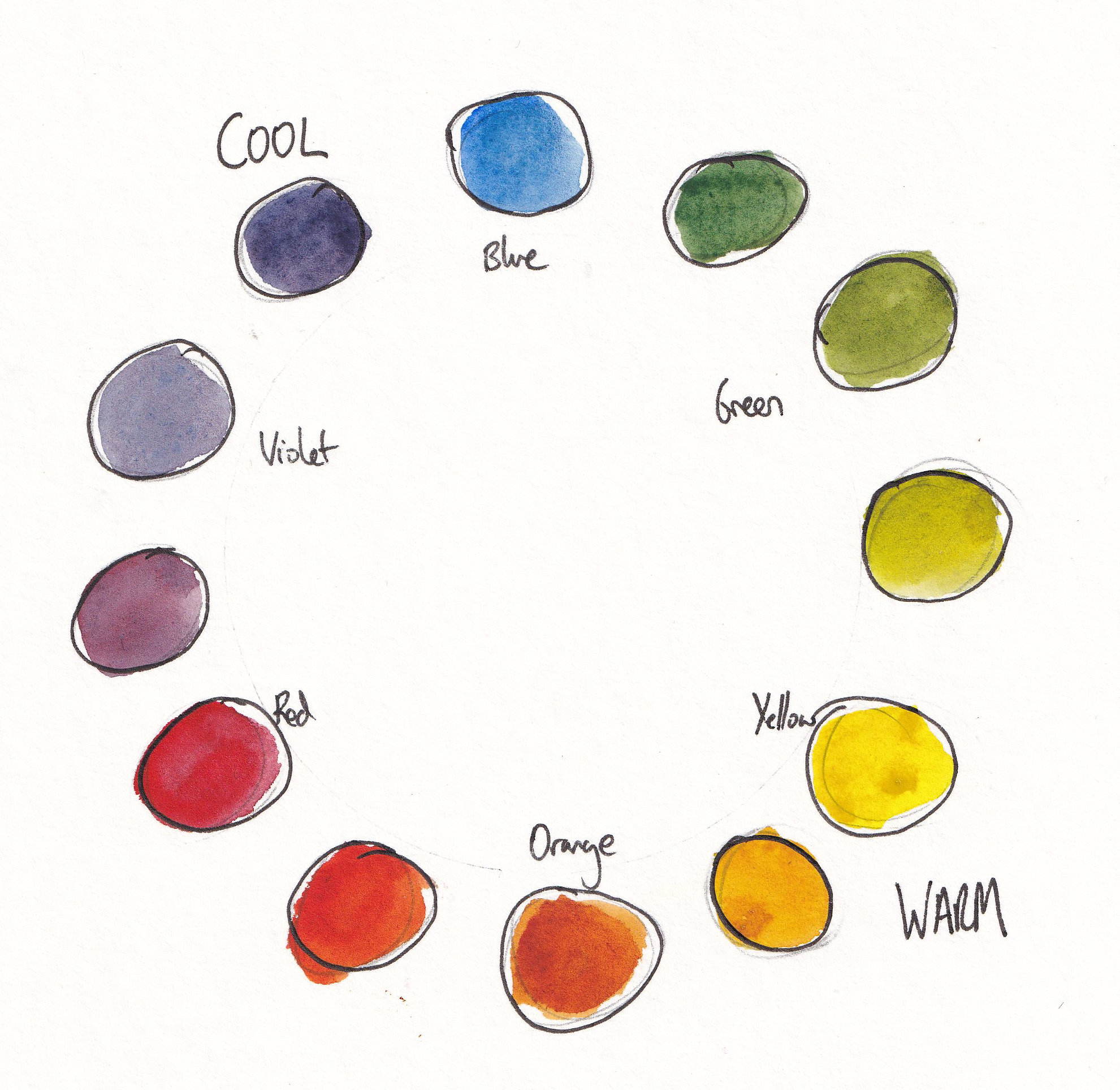
In sketching, a colour wheel helps you:
Understand how pigments interact
Build harmonious colour schemes
Avoid muddy mixes
Choose effective contrasts for impact and balance
But here’s the catch: not all colour wheels are the same. Which brings us to an important distinction…
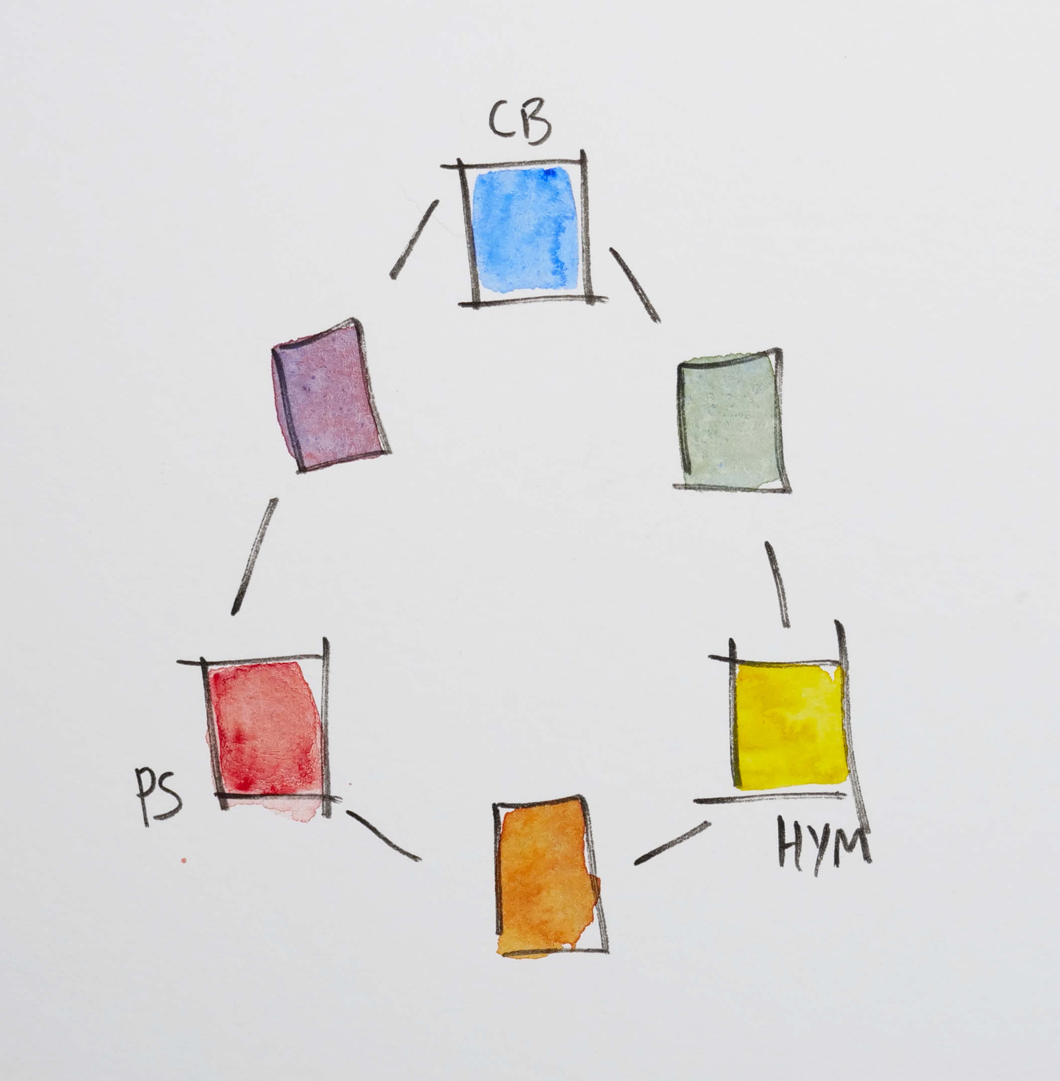
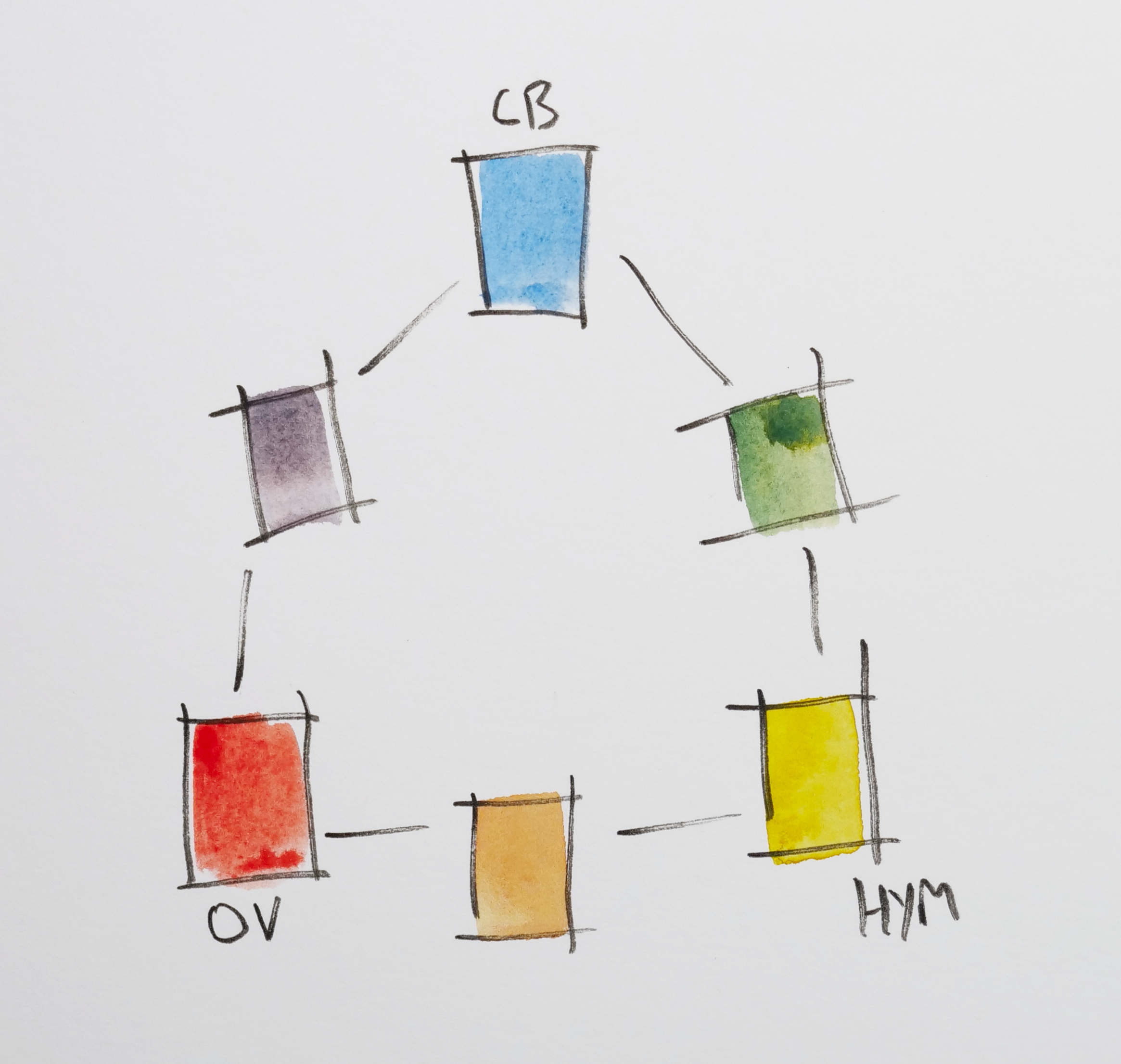
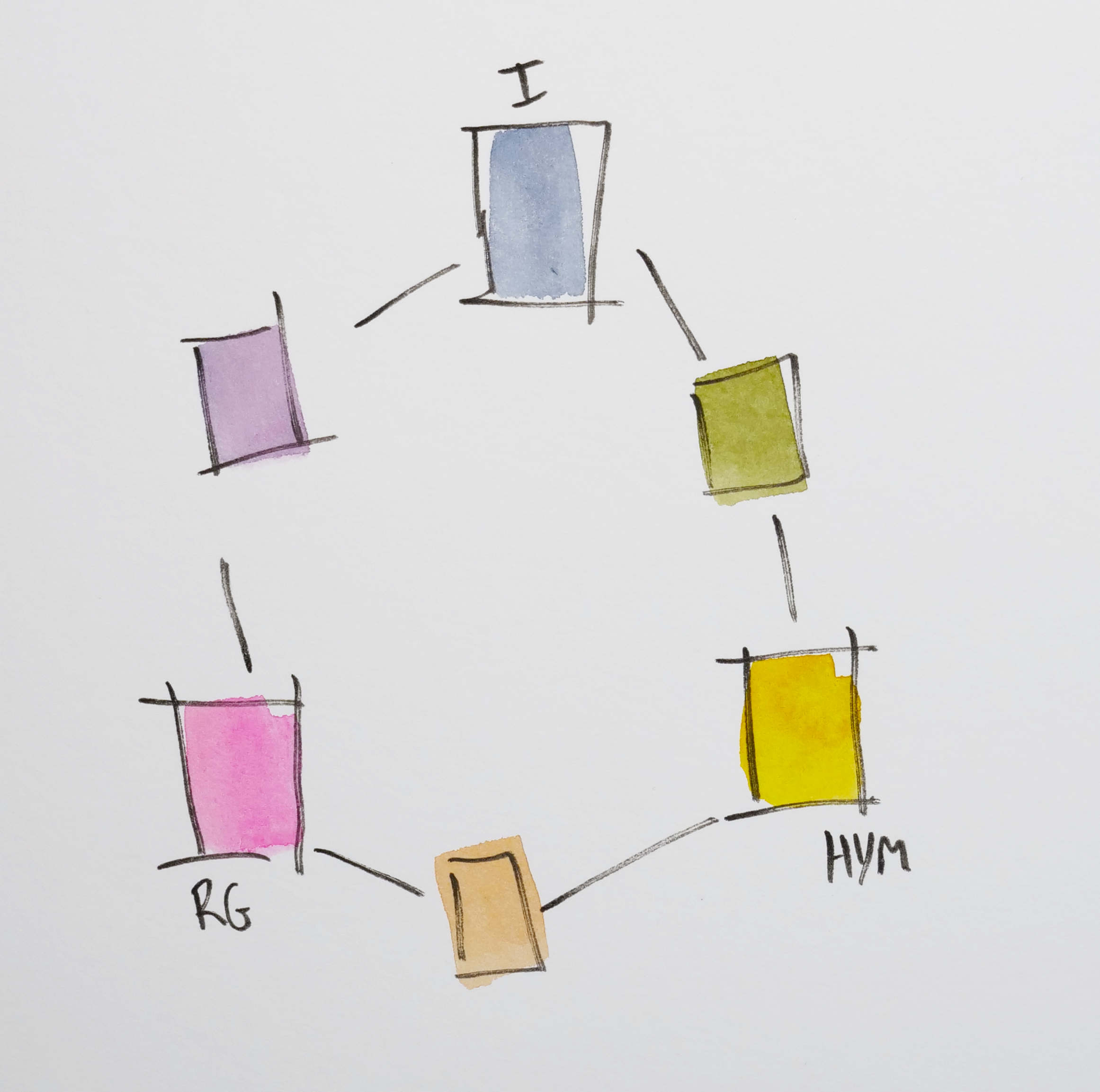
Pigment-Based vs. Mixed Colour Wheels
Mixed Colour Wheel
A mixed wheel is created by physically mixing your three chosen primaries and mapping the resulting secondaries and tertiaries. This is where it gets interesting: different sets of primaries will create dramatically different wheels.
For instance, I tried these triads:
Hansa Yellow Medium + Cobalt Blue + Pyrol Scarlet – Bright, clear mixes; good range of oranges and greens.
Hansa Yellow Medium + Cerulean Blue Chromium + Organic Vermillion – Much softer, greyish purples and more vibrant and interesting greens. I really likely the earth/sienna-orange that developed too.
Hansa Yellow Medium + Indigo + Rhodonite – Moody, muted wheel with some pastel feeling secondaries.
This is why it’s so helpful to build your own wheel with your specific colours—it tells you what to expect when mixing and reveals surprising relationships unique to your palette.
Pigment-Based Colour Wheel
A pigment-based colour wheel simply maps out the physical pigments you own—like Hansa Yellow Medium, Cobalt Blue, and Pyrol Scarlet. It shows how they look straight from the pan or tube and how they sit next to each other on a visual wheel.
And instead of mixing the secondary colours, you use pigments from your pans as those secondaries.
This is useful for:
Understanding your palette’s natural temperature balance
Identifying gaps or overlaps in hue
Building intentional colour schemes from your actual paints
It's also useful to understand your colours beyond just how to mix three of your primaries - here, for example, I have use cobalt blue, hansa yellow but also cobalt green and green appatite genuine to give me more range in my secondary colours despite limited primary hues.
Warm vs. Cool Colours: Why They Matter
Understanding warm and cool versions of each hue is essential for successful mixing.
Warm colours include reds, oranges, and yellow-golds. In my palette: Pyrol Scarlet, Organic Vermilion, and Hansa Yellow Medium lean warm.
Cool colours include blues, greens, and bluish-purples. Cobalt Blue, Cerulean Chromium, and Cobalt Green are cool in temperature.
Even within a single hue, you can have warm and cool variations:
Pyrol Scarlet is a warm red, while Rhodonite Genuine is a cool, pinkish red.
Cobalt Blue is relatively neutral, but Indigo leans cool and dark.
Cobalt Green is cool and minty, whereas Green Apatite Genuine is warmer and more naturalistic.
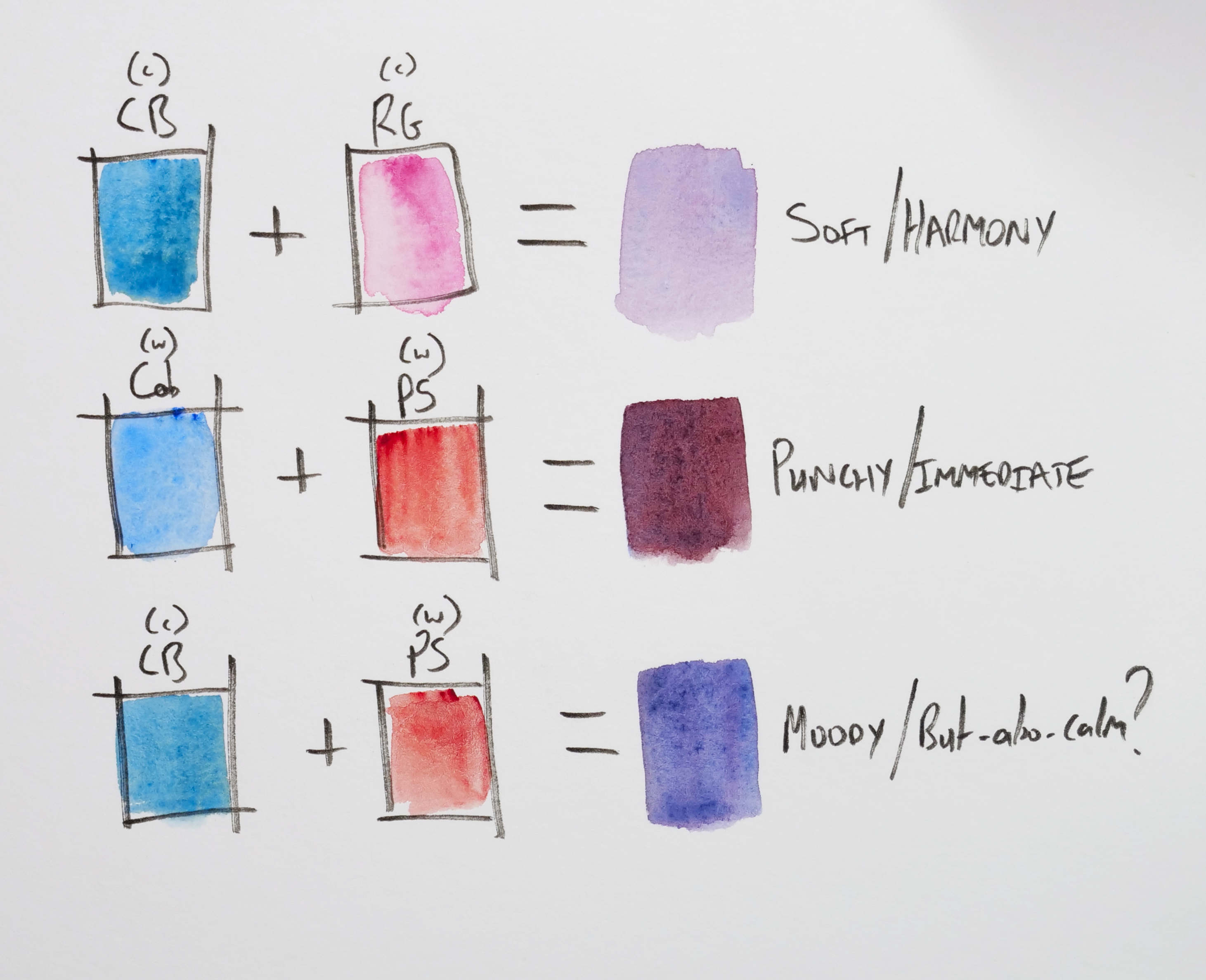
Why does this matter? Because mixing across temperatures creates balance or conflict (see the example image below):
Cool + cool = subtle, harmonious tones (great for calm and atmosphere)
Warm + warm = vibrant mixes (great for energy and focus)
Warm + cool = risk of mud or greys—but also complex and beautiful neutrals
Knowing your colour temperatures helps you mix intentionally, avoiding surprises and making smarter choices on the page.
Practical Examples Using Your Palette
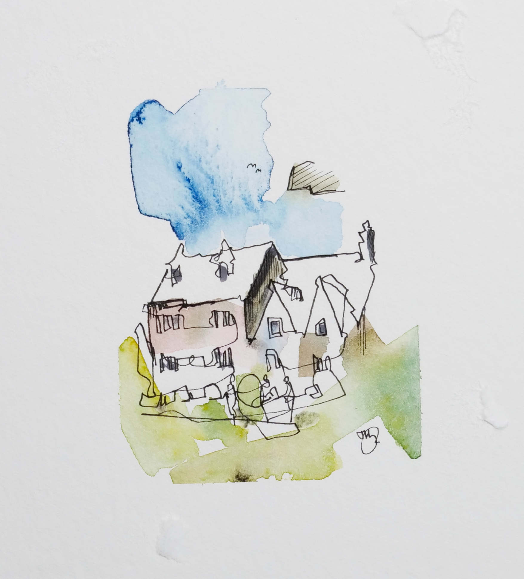
Let’s say you want to sketch a bright, sunlit village like the one below...
Use Hansa Yellow Medium, Pyrol Scarlet, and Cobalt Blue for a classic, vibrant primary triad. In the image below I also used some Indian red to deepen the range of red hues.
Add Cerulean Chromium for sky washes—it’s soft and granulating, perfect for atmosphere.
Use Quinacridone Sienna or Lunar Earth to create rich neutrals for walls, shadows, and ground textures.
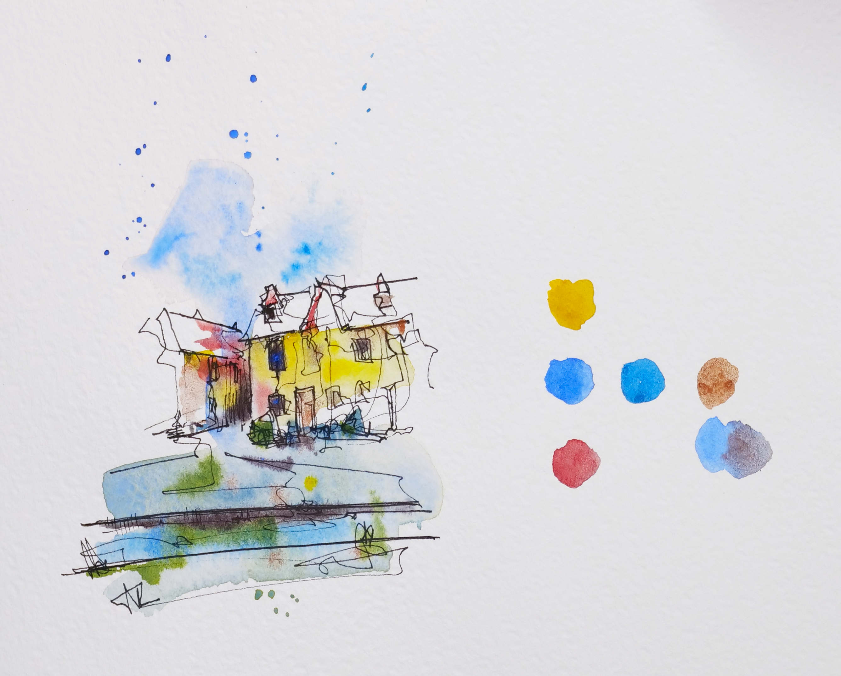
Now let’s imagine a moody city sketch on a grey day:
Try Indigo, Payne’s Grey, and Cobalt Green to build cool, desaturated mixes.
Add Rhodonite Genuine sparingly to create accents or contrast.
Use Green Apatite Genuine for gritty textures and foliage—it has beautiful variation and natural pigment separation.
Tips for Building Your Own Colour Wheel
Pick your primaries – Try several triads from your palette.
Mix secondaries – Orange, green, and purple using only your chosen three.
Add tertiaries – Mix further between the secondaries.
Label everything – Note which pigments created which hues.
Repeat with different triads – Notice how your wheels shift depending on your pigment choices.
This exercise helps you deeply understand how your specific paints behave, which is far more valuable than memorising generic colour theory.
Final Thoughts
A colour wheel isn’t just a chart—it’s a map of your creative decisions. It helps you explore your palette’s potential, understand its limitations, and use it with more clarity and confidence.
Your palette—with its blend of primaries, earth tones, and granulating pigments—offers a huge range of expressive potential. Whether you’re working intuitively or planning a scene around a complementary scheme, your understanding of colour relationships is the key to sketches that feel intentional, harmonious, and full of life.