- May 2, 2025
Colour Schemes in Sketching: Bringing Harmony and Energy to Urban and Landscape Work
- Toby Haseler
🎨 Colour Schemes in Sketching: How I Use Colour to Bring My Sketches to Life
When I first started sketching regularly, colour often felt like a guessing game. I’d lay down washes that clashed or looked flat, or I’d find that everything felt a bit too muddy or disjointed. It wasn’t until I started intentionally using colour schemes that things really started to click.
In this post, I want to walk you through how I think about colour schemes in sketching—especially for urban scenes and loose landscapes—and how you can make the most of them using the kinds of colours I keep in my palette.
🌈 Why Use a Colour Scheme?
A colour scheme is just a deliberate selection of colours that work well together. It’s not about rigid rules—it’s about giving your sketch cohesion, clarity, and impact. For me, it simplifies decision-making, speeds up the sketching process, and gives the final result a stronger mood or atmosphere.
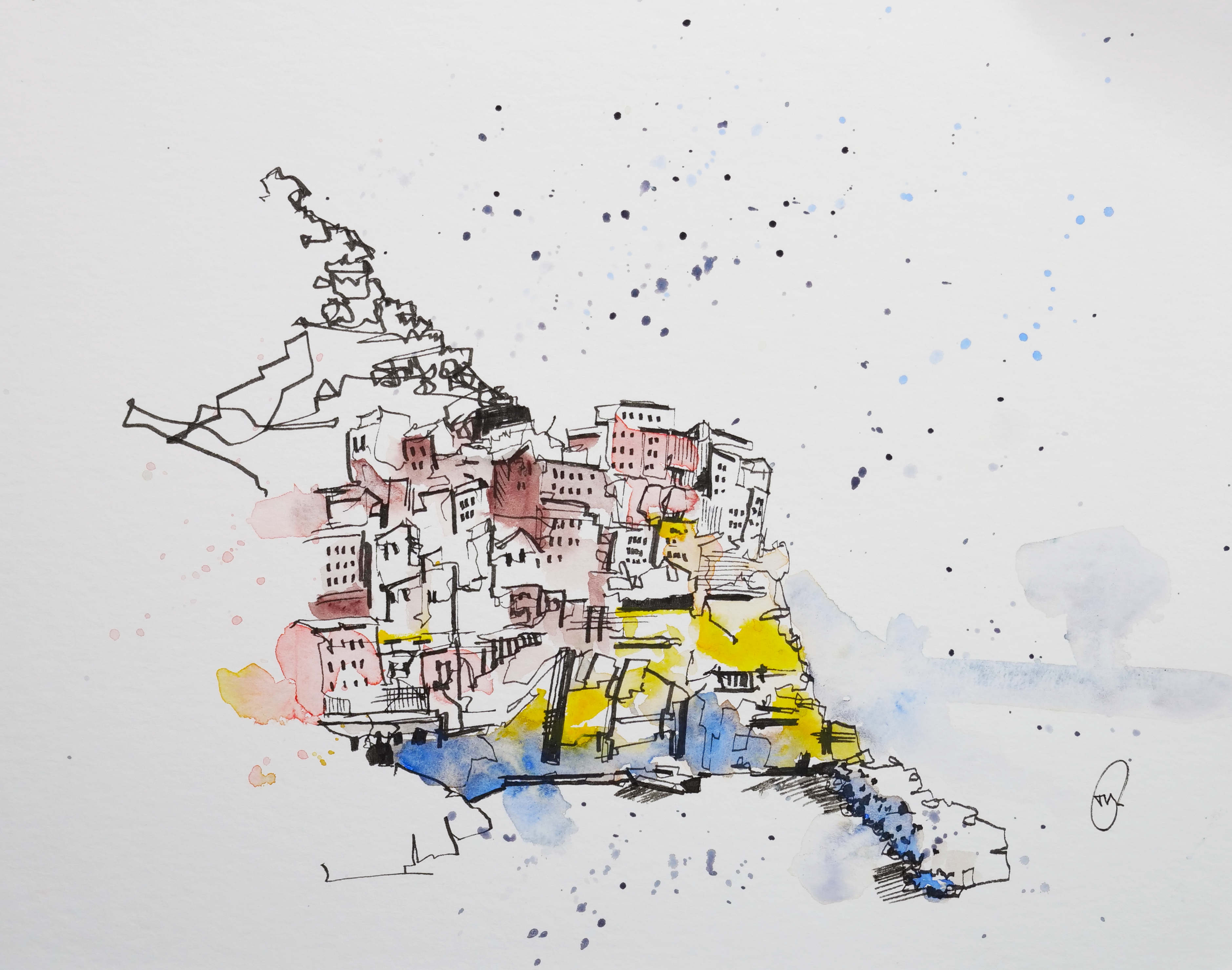
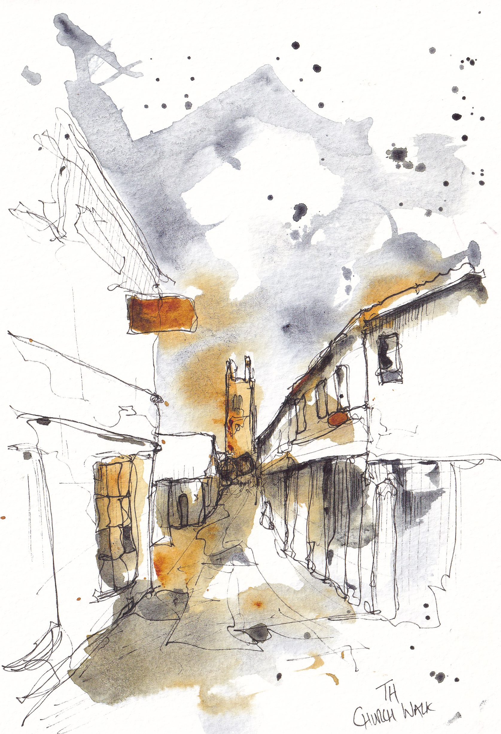
In this complex scene (which is featured in my comprehensive sketching course) is an example of piece where a colour scheme was really useful. Simplifying the colours, allowing me to capture my version of the scene loosely whilst making it achievable and fun.
🎯 My Palette
Before we dive in, here’s a quick look at the colours I regularly use:
Lavender
Cobalt Blue, Cerulean Chromium, Indigo, Payne’s Grey
Pyrol Scarlet, Organic Vermilion, Rhodonite Genuine
Hansa Yellow Medium
Quinacridone Sienna, Lunar Earth
Cobalt Green, Green Apatite Genuine
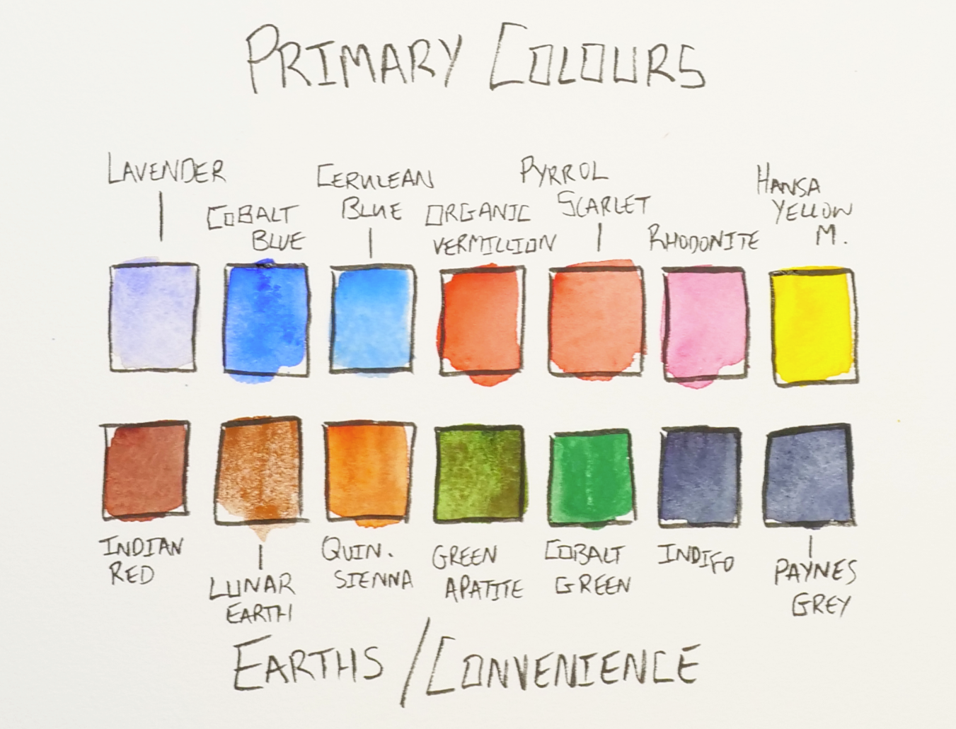
I don’t always use every single colour in a sketch—in fact, I often limit myself to just 3–4. That’s where colour schemes come in handy.
🔻 Complementary Colour Schemes
Complementary colours sit opposite each other on the colour wheel. They create tension, contrast, and energy. Think of blue and orange, or red and green.
How I use them:
If I’m sketching a building with a lot of red brick (Pyrol Scarlet or Organic Vermilion), I might cool down the shadows with Cobalt Blue. Or if the scene has a dull grey sky, I’ll throw in some complementary warmth with Rhodonite Genuine or Hansa Yellow Medium.
My go-to combos:
Cobalt Blue + Orange (mixed from my palette) – Bright and punchy for cityscapes.
Hansa Yellow Medium + Purple (mixed from my palette) – A moody pairing.
Indigo + Quinacridone Sienna – great for a atmospheric evening, mixing into lovely neutral tones
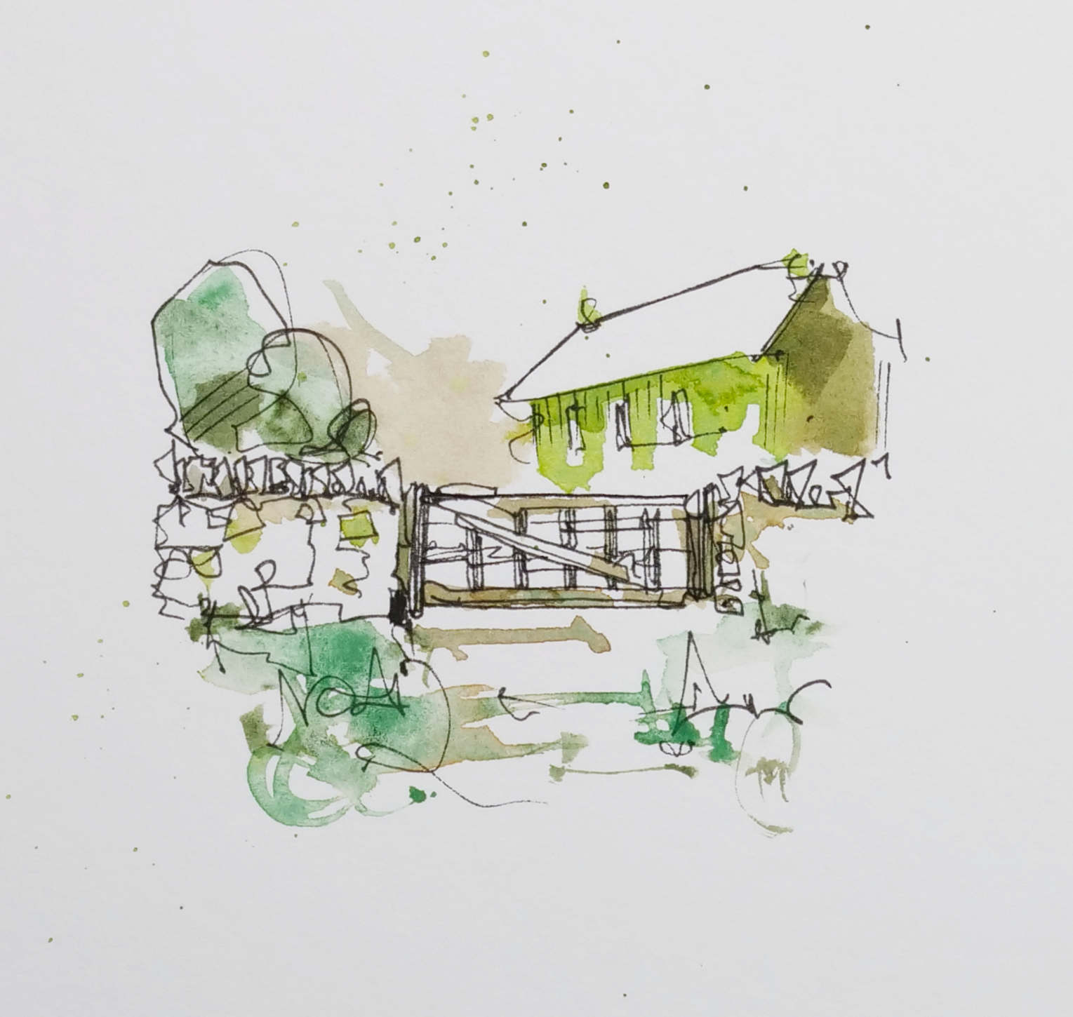
🔶 Analogous Colour Schemes
These are colours that sit next to each other on the wheel—like blue, blue-green, and green. They’re harmonious and calm.
How I use them:
This is my favourite approach for loose landscapes, and also for creating quick and satisfying sketches. Simply picking out a range of hues that are all similar means you end up focussing more on the value, and less on the exact hues in a scene. A really observational and artistic way to create!
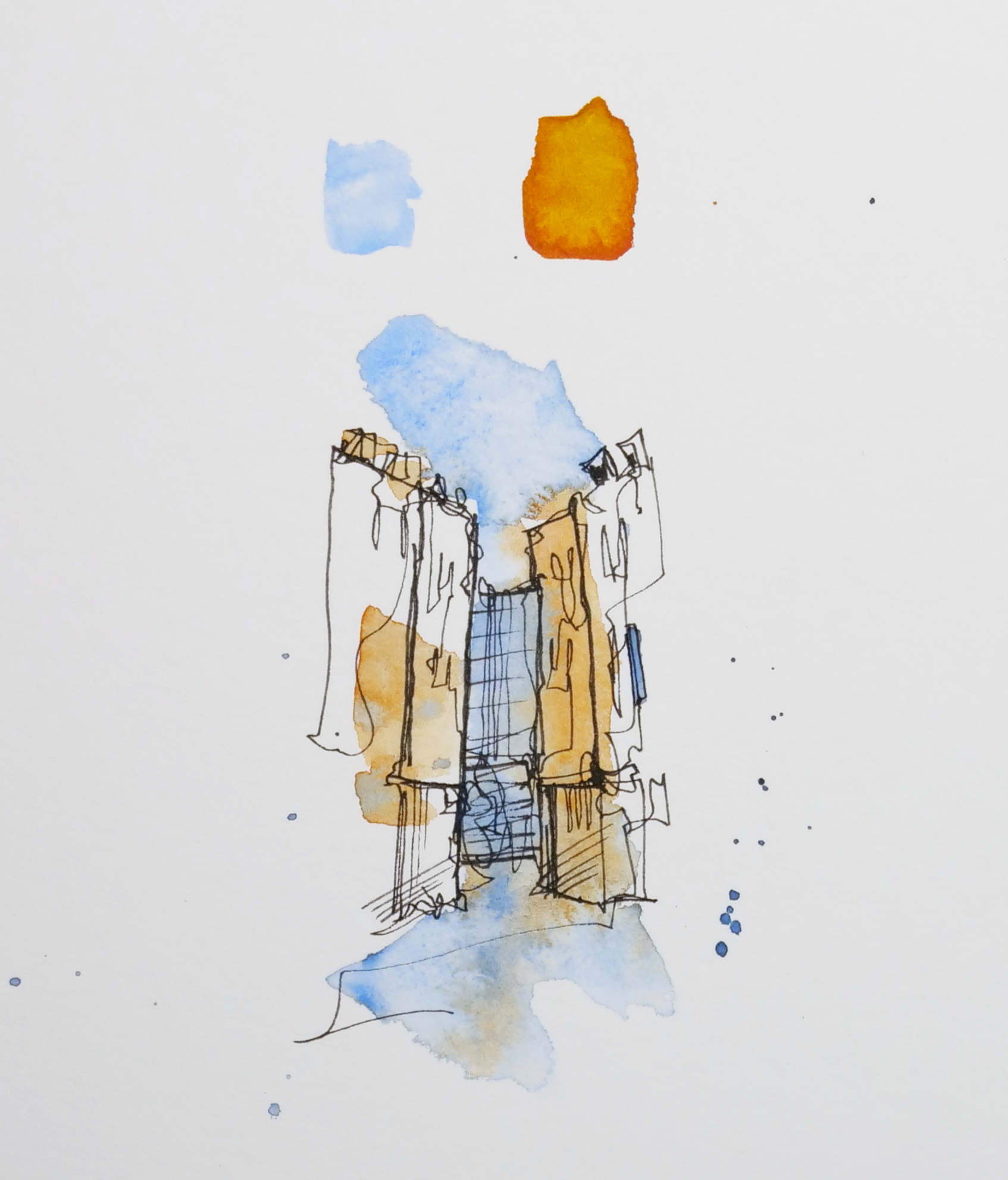
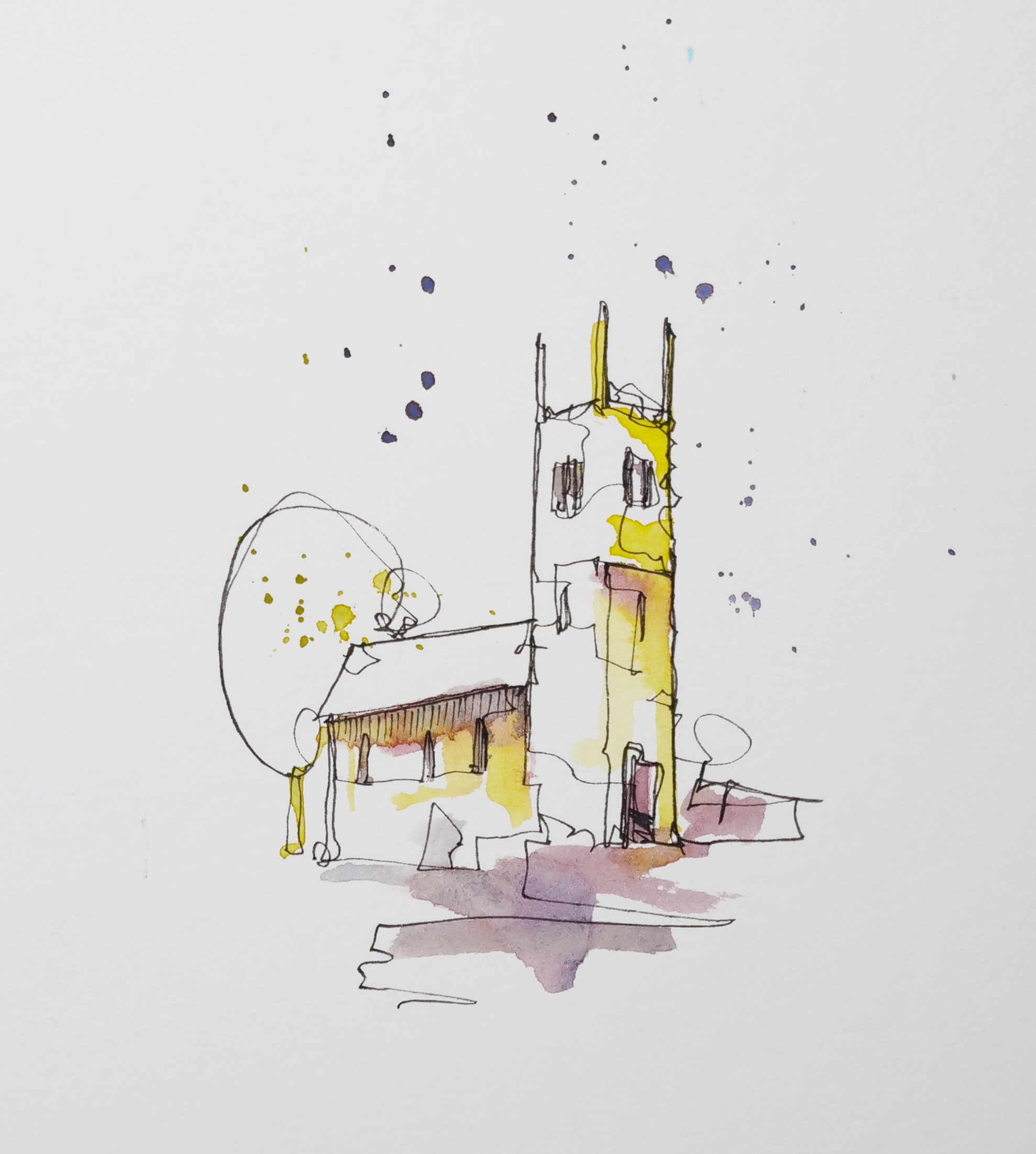
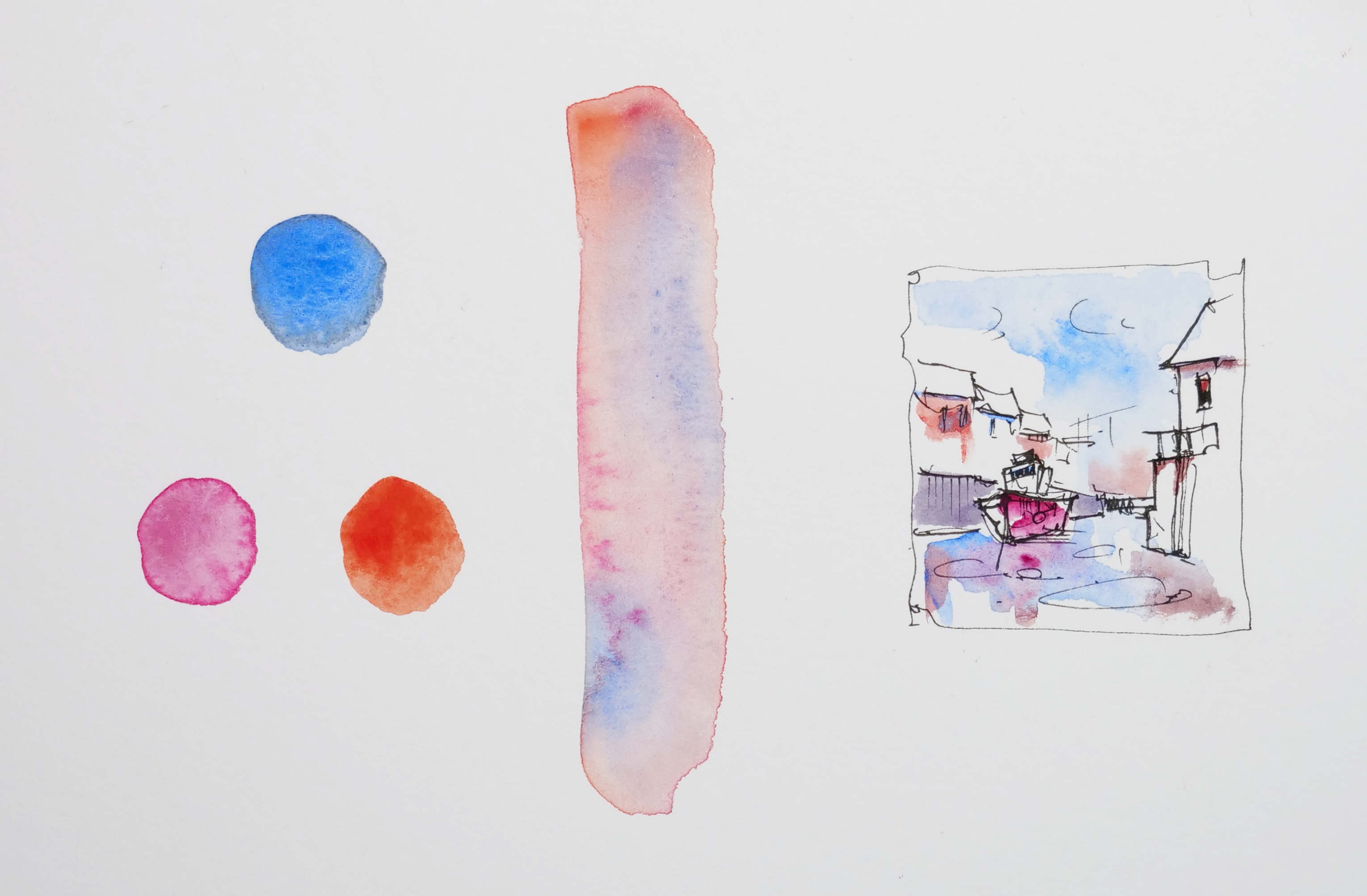
Here is a mini gallery of ideas:
.
How I use them:
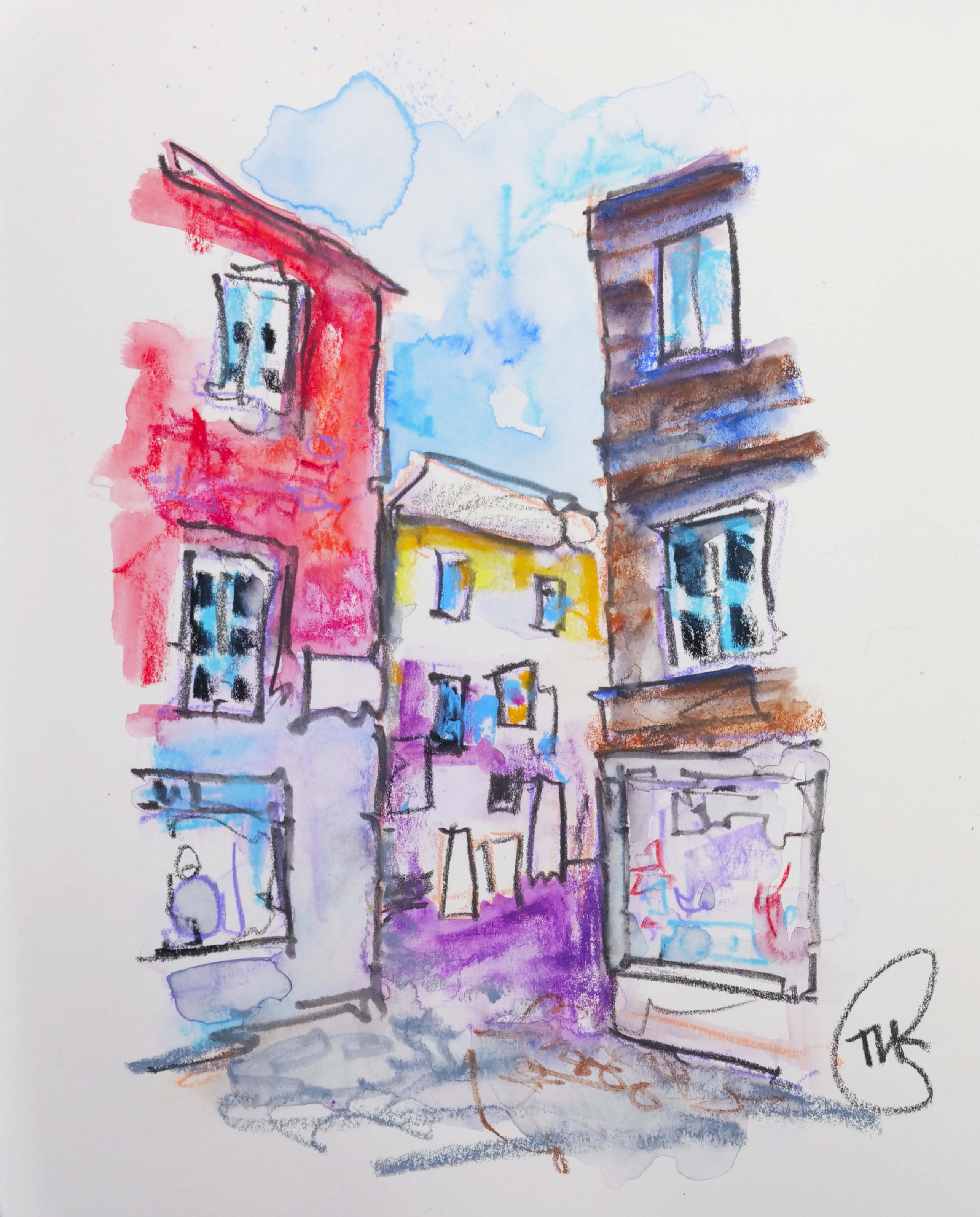
This scheme works well when I want my sketch to feel lively and bright—like a street scene with lots going on. But I’ll usually pick one to dominate and let the others support.
🌗 Split Complementary
This is a softer take on complementary colours—you use one colour and the two neighbours of its opposite. It’s a little more nuanced, less high-contrast.
How I use them:
These are great for scenes that need harmony but still a bit of visual interest. If I want subtle variation without a big pop, this is where I turn.
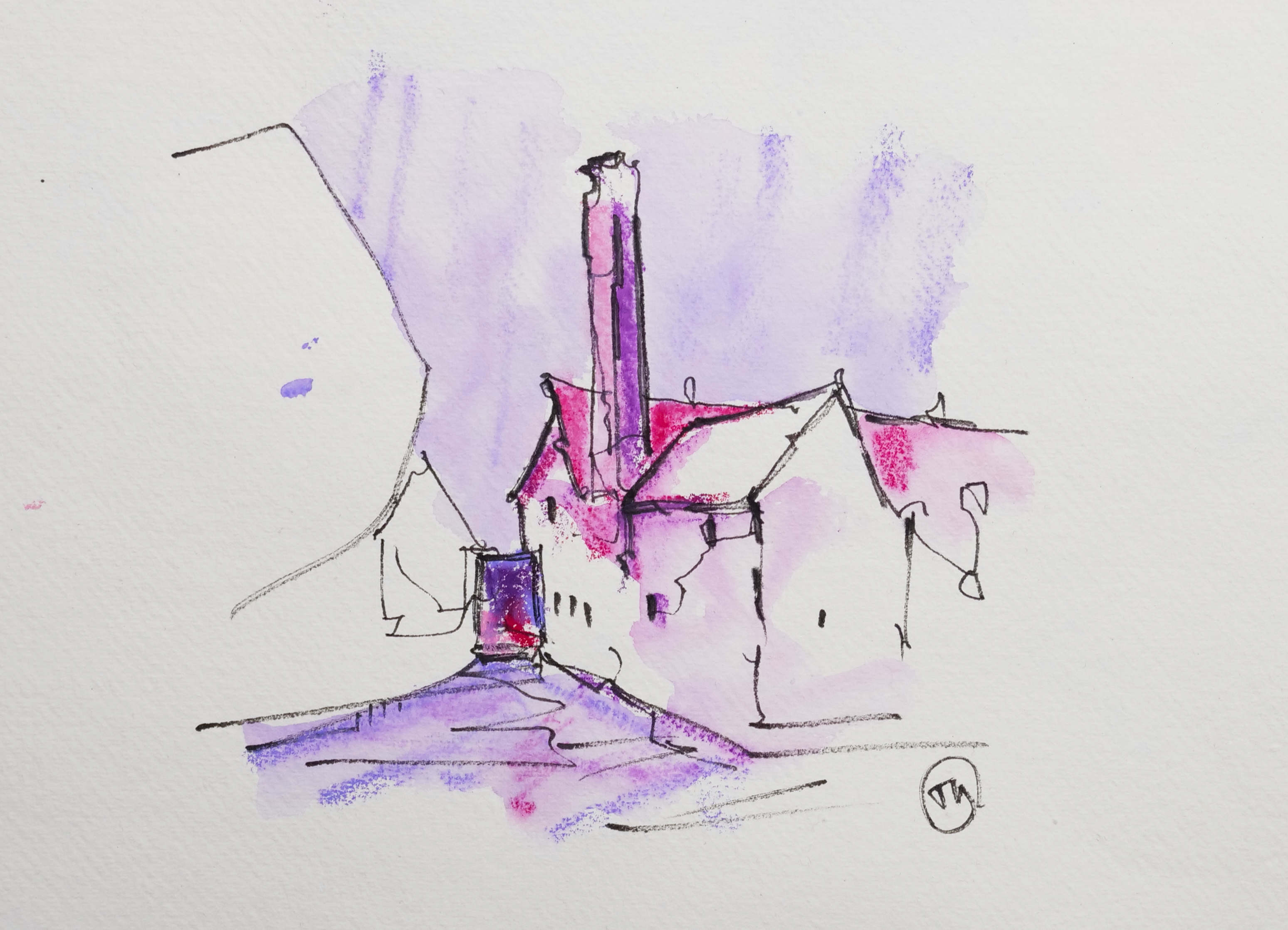
🧃 Monochrome and Limited Palettes
Sometimes I keep things ultra-simple. One hue, maybe two. This really lets me focus on value, brushwork, and the mood of the scene.
How I use them:
When travelling light, or if I want to experiment with just tone and texture. Indigo alone gives me a whole range, from inky blacks to soft washes. Payne’s Grey plus Lunar Earth? Lovely for gritty city scenes.
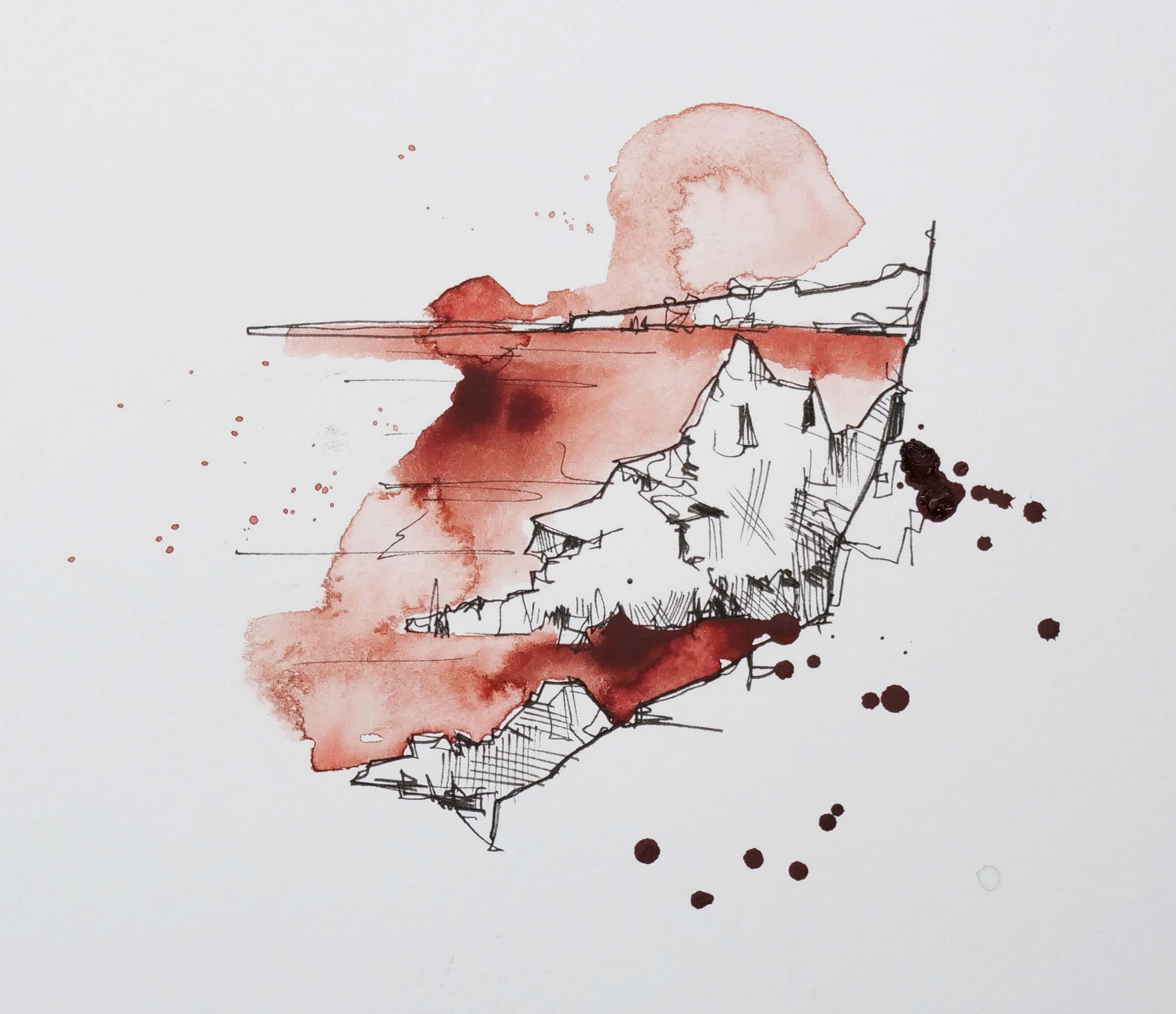
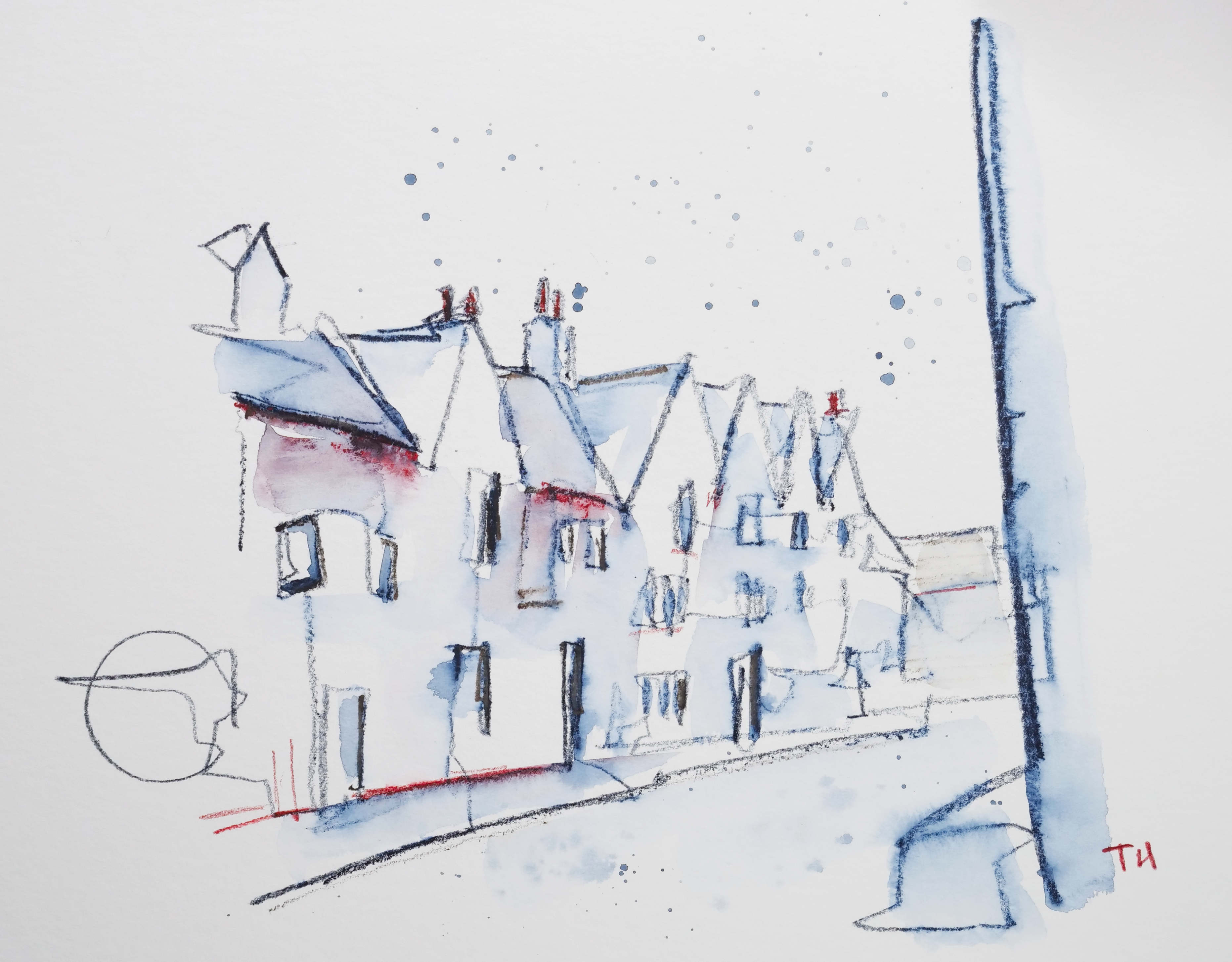
For example, this scene above was bought to life with a wash of 'earth red', an acrylic ink colour. And the scene below largely uses indigo, with a touch of red just to bring a bit of variety and perhaps suggest shadows.
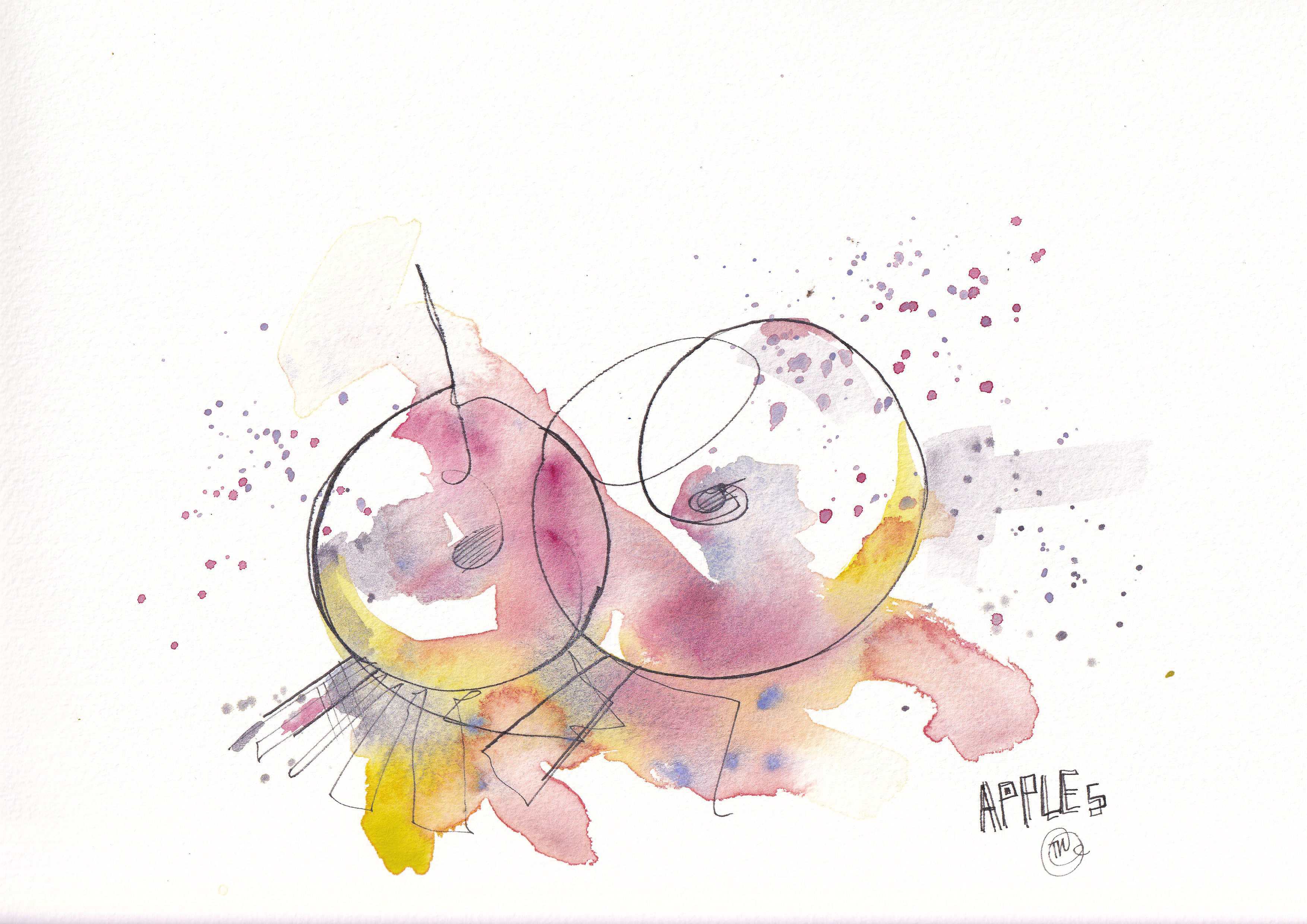
💡 My Final Thoughts
You don’t need to overthink colour schemes—but understanding them gives you freedom, not restriction. Once you know how a scheme feels and behaves, you can bend the rules, improvise, and still end up with something that feels intentional.
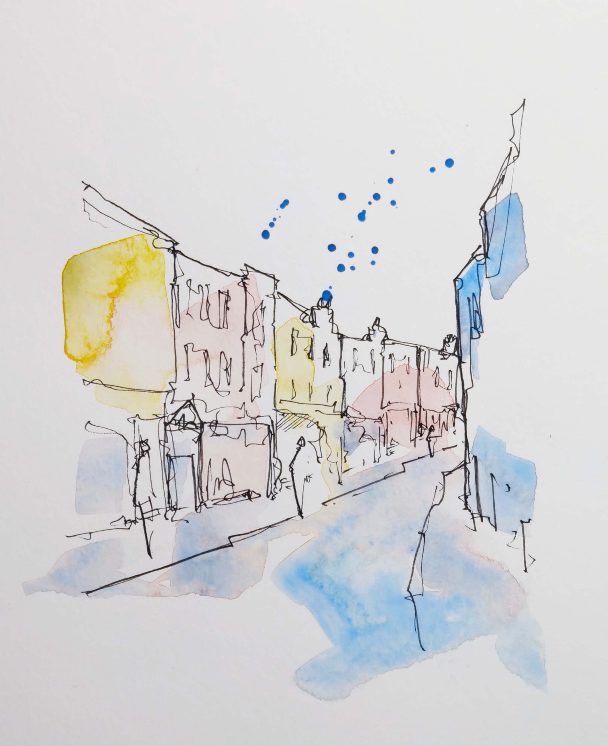
The scene above, for. example, doesn't have such a limited palette. But I would argue the bright and vivid feel comes from the primary colours used within. Then the variety and depth comes from pairing that with moody earthy tones rather than introducing more and more vivid hues.
Next time you're out sketching, try choosing a scheme before you start. Give yourself 2–4 colours and see how it pushes you to work more creatively. Whether it's rooftops in a village or windswept fields, a good colour scheme can do a lot of the heavy lifting for you.