- Oct 12, 2024
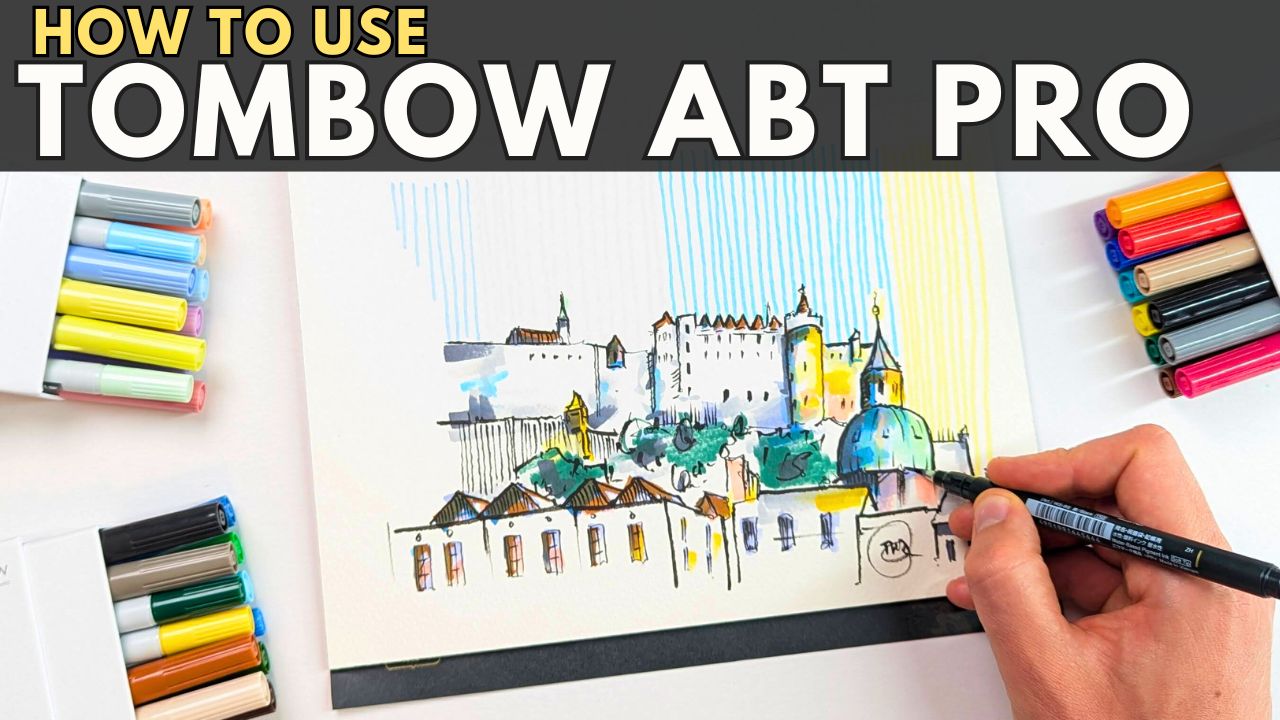
Using TomBow Brush Pens
- Toby Haseler
- 1 comment
TomBow brush pens are a high quality Japanese marker, and the 'ABT PRO' range is their alcohol ink variety - and I've grown to love it, replacing my Winsor Newton Promarkers as my daily sketching 'workshorse'.
At the end of this blog post is a 'cheat sheet' - including swatches, layering and mixing examples. And just below is a the accompanying YouTube video on how to use TomBow ABT PRO alcohol markers!
What makes these pens different?
The TomBow ABT PRO is a slim pen, much slimmer and easier to carry around than the competitors like Promarkers and Copics. It has a chisel tip and a lovely soft brush, which is another key differentiating factor.
The alcohol-ink is otherwise similar to competitors but, as we will see, the brush allows far more interesting textures, mixing and layering properties.
I also find the TomBow markers to have a more subtle range of colours. One issue I always had with Promarkers is how bold they were - inevitably overtaking the whole image if you weren't careful. This isn't the case with these TomBow markers.
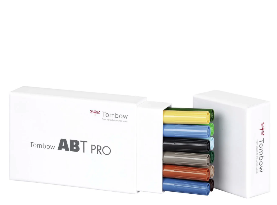
They are, I believe, available in 107 colors + blender and different sets.
I am, however, reviewing some very specific sets...
Here are affiliate links on Amazon. This will earn me a small commission should you buy from these links, but won't affect the price you pay.
TomBow ABT PRO - Landscape Set - find them here
TomBow ABT PRO - Pastel Set - find them here
TomBow ABT PRO - Basic Set - find them here
These pens have an RRP of £54 for a set, but you can routinely find them for £20 or so on sale. And I picked up a large number of individual pens for £1 each as well from a discount retailer.
I also highly recommend the TomBow Fude pens - you can find them here (Affiliate Link), and I use them in the accompanying video.
How many colours do you need?
There is no great answer to this, other than the warning... 'however many you have, you'll always want more!'
In reality, I like the pastel and landscape sets the most - they have a variety of colours that build nicely together, but are also soft and gentle enough to sensitively layer and work together.
Each of the sets, however, has strengths and weaknesses.
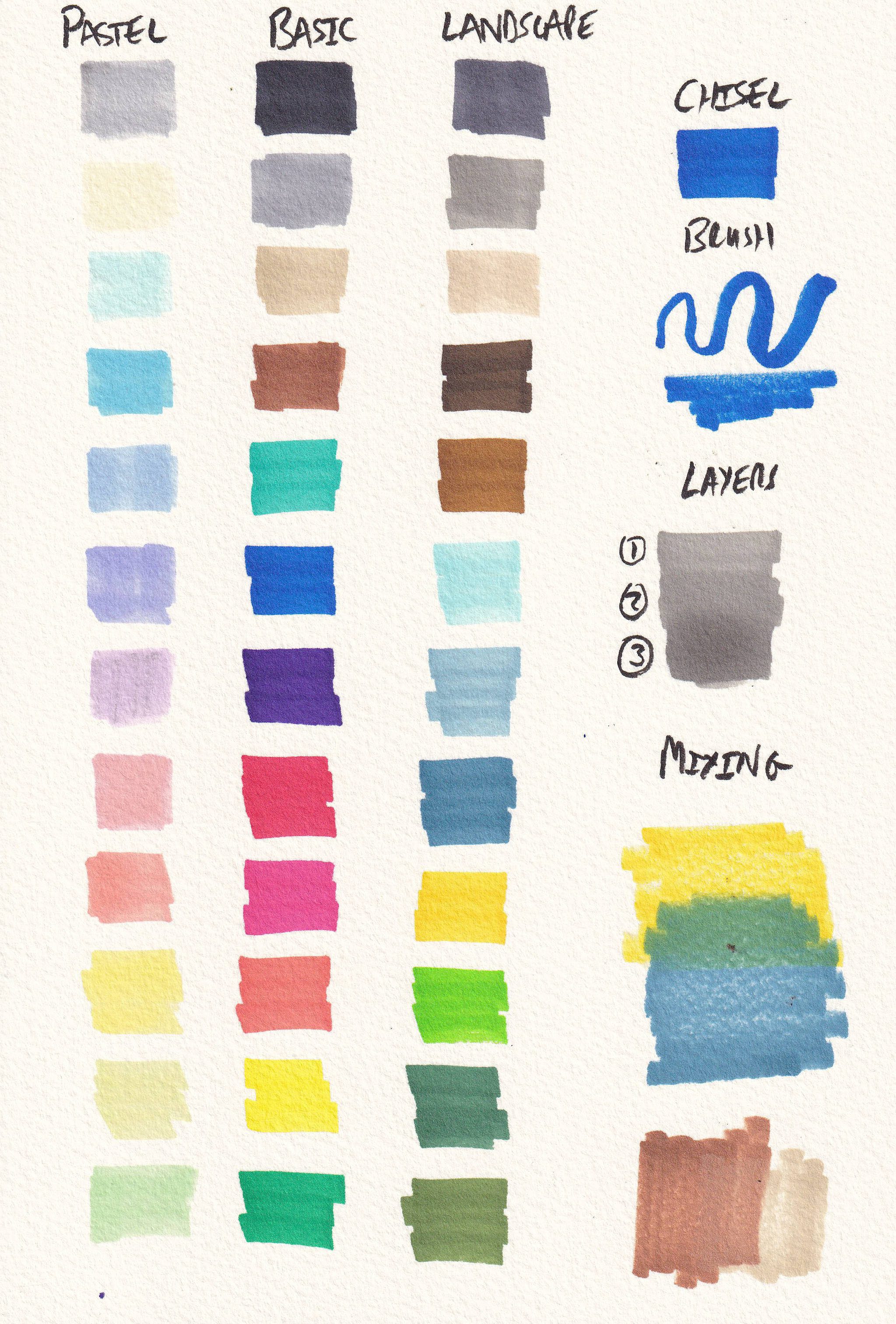
You can see, for example, the pastel colours are lovely and soft - but they lack anything with real punch. With just this set you'll have difficulty creating contrast.
The basic set is bold and brash, wonderful for cartooning and illustration, but without subtely - and a real lack of earthy colours and greens means landscapes will be tricky and abstract.
Finally, the landscape set is my overall favourite - but even there we lack in real warmth. There are no bricky reds, colours of sand, only muted blues and greens to create soft and very British landscapes. But certainly no bright Swedish barns within those landscapes.
In practice, I mostly carry the pastel and landscape sets together - or even all three of these sets at once!
How to use them?
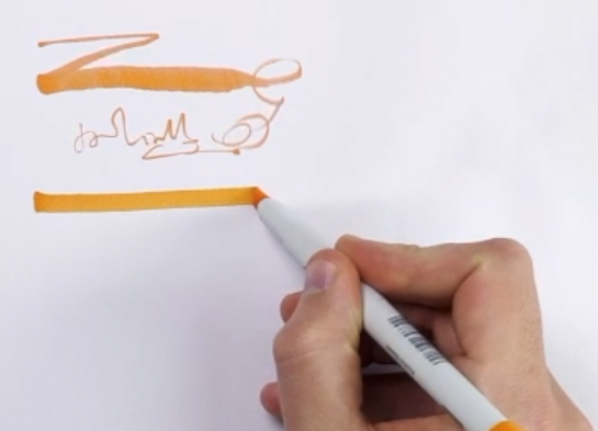
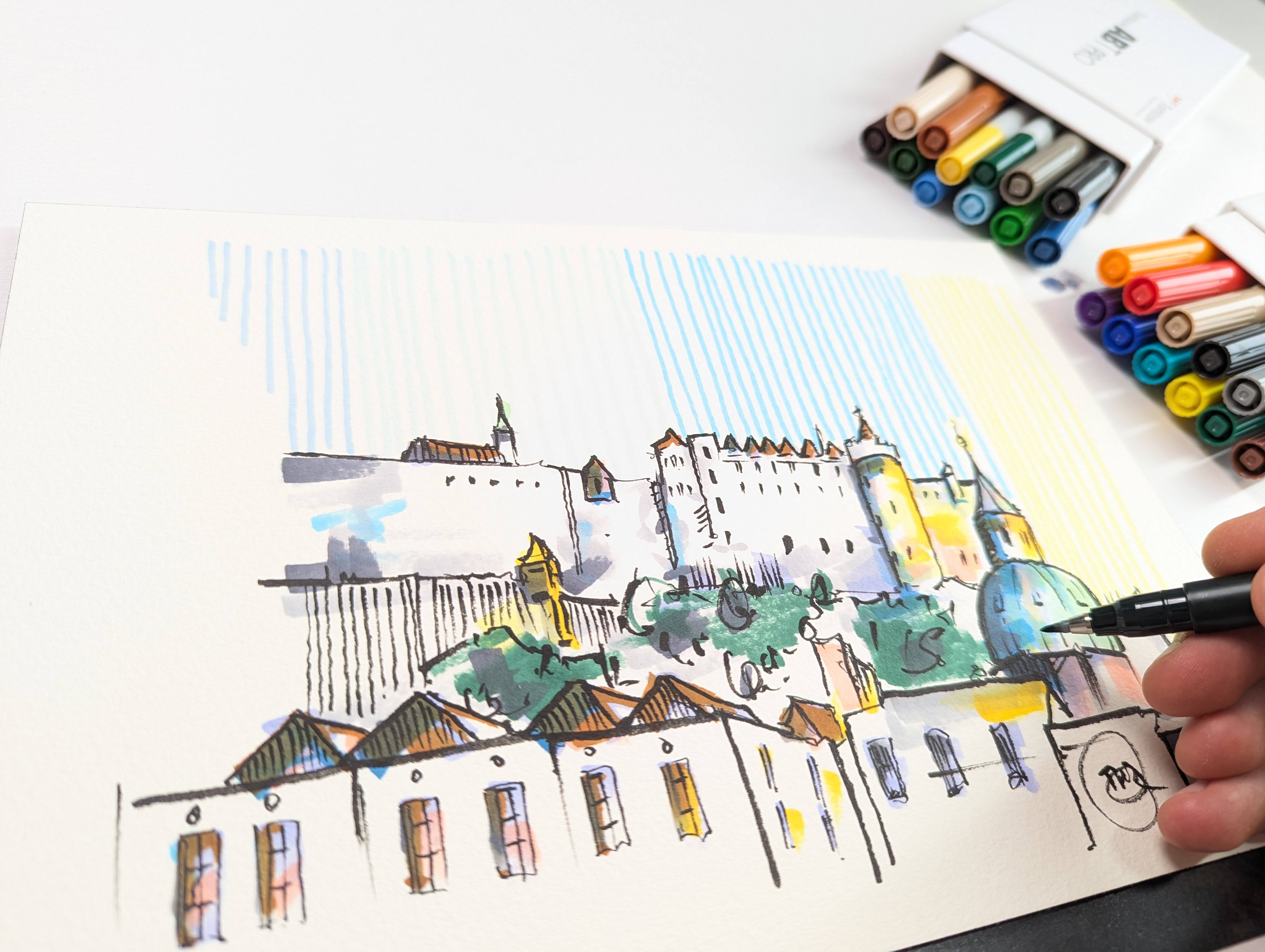
The first thing I recommend doing is exploring the range of marks that you can make - from the variety of the brush to the certainty of the chisel nib.
Next explore mixing properties - these colours blend excellently on marker paper, but I rarely use this as I much prefer the soft blend and bleed they provide on my beloved watercolour paper. That does limit their mixability, but it doesn't eliminate it and it adds a huge amount of texture.
Finally, take a moment to practice layering - you'll quickly see how layers of colour can be built up - working from light to dark (just like watercolors) to produce depth, and again altering the textures.
The key is to let layers dry before layering, otherwise you'll get a softening of the colour and a flattening of the texture without a change in other ways.
Certain 'subjects' are still more tricky
Without a doubt, like any media, there are strengths and weaknesses - with alcohol makers, creating an effective sky can be one such challenge.
One of my favourite 'cheats' is to hatch in the sky - that suggests colour, but also plays to the illustrative strengths of these pens.
Or here is a different approach, layering the colours and mixing two or even three blues to create a little variety - but also, inevitably, a bold statement of a sky!
More ideas to try!
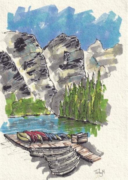
Though they can feel brash and bold - subtle layering of bright blues here are, I think, a very effective touch that enlivens Betty's fur. And the purples on the pink pig also add variety in a painterly fashion.
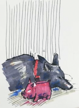
As with so many things - less can often be more. Rather than filling in a whole scene, why not use the markers selectively adding suggestive touches and marks rather than feeling the need to build your entire scene with very strong colours.
Be prepared to abstract!
As with so many forms of art, the key to enjoying yourself is to work with the medium - and then you can essentially make anything look great! You just have to make decision, abstract areas, simplify and have a bit of fun.
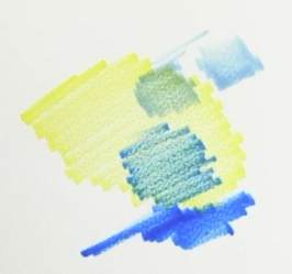
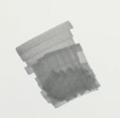
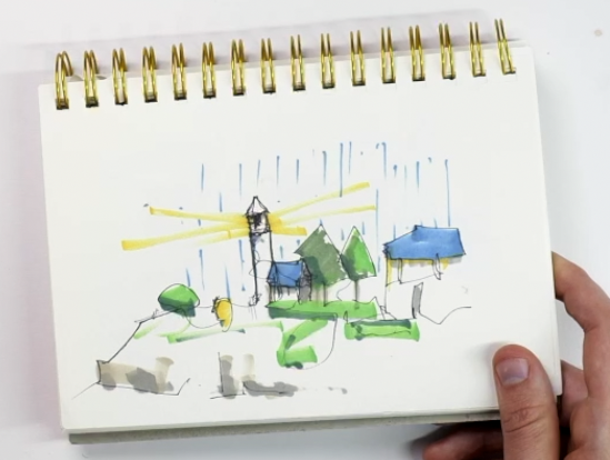
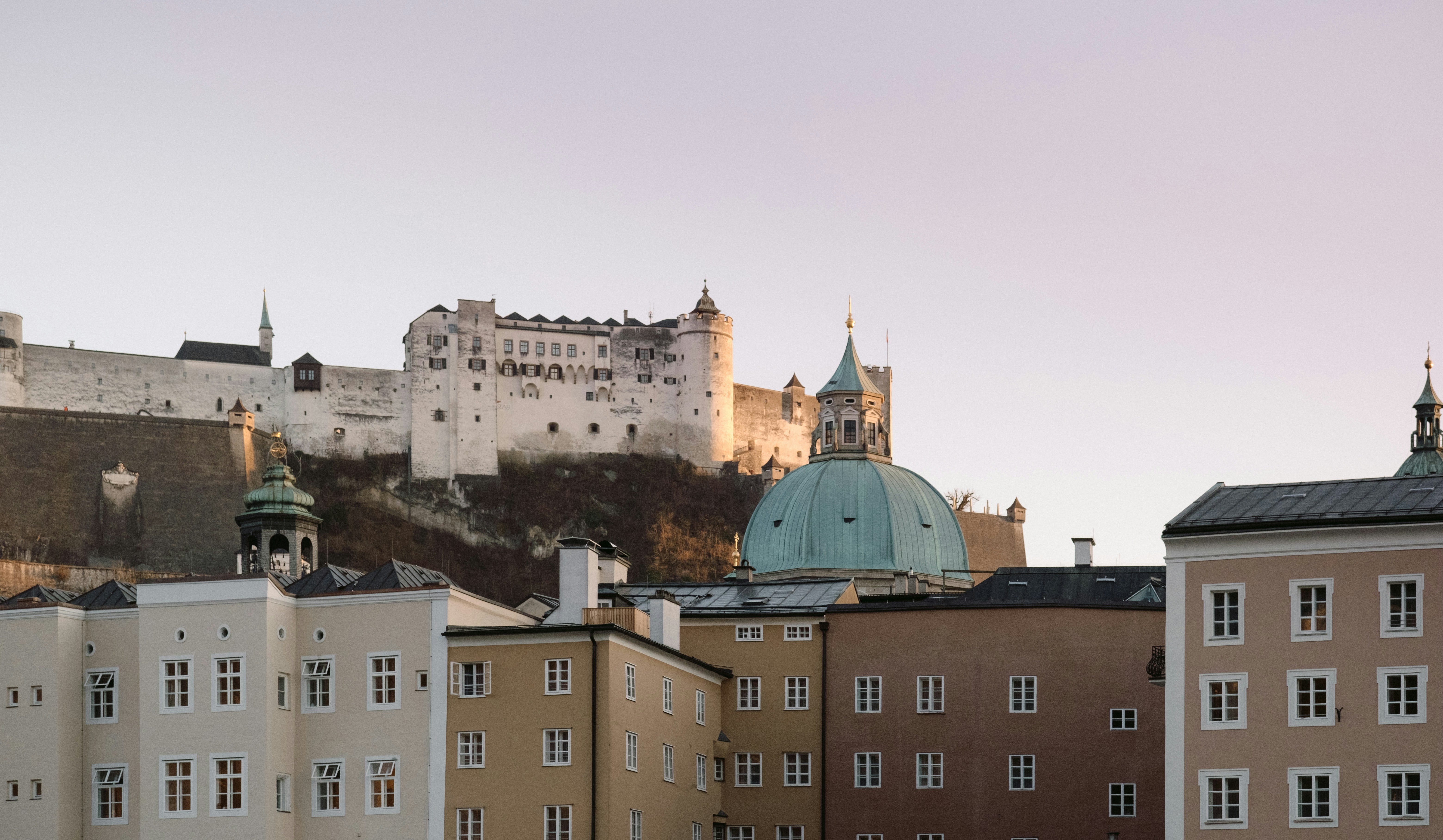
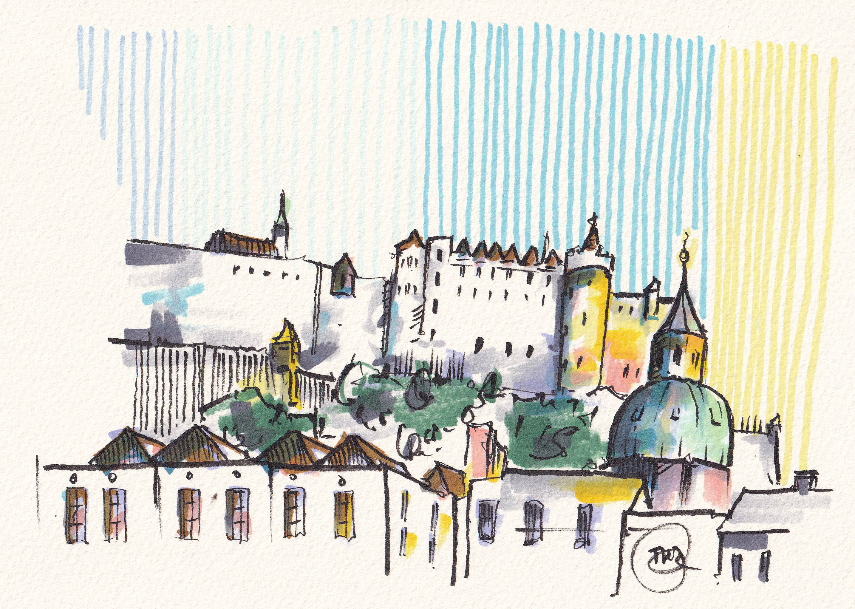
In the accompanying YouTube video - https://youtu.be/hn60iNyHfow - you can see how I turn this photo:
Into this scene...
And here is the cheat sheet ...
You can use this to reference the colours you might wish to acquire, as well as to see the effects of the colours on watercolour paper.
Here are affiliate links on Amazon.
TomBow ABT PRO - Landscape Set - find them here
TomBow ABT PRO - Pastel Set - find them here
TomBow ABT PRO - Basic Set - find them here

